
In today’s information age, many organizations have large websites with thousands of pages and seemingly endless content libraries. People visiting these sites can easily get lost in an ocean of links and menus. On websites of this size and scale, simple navigation systems are like a sailor’s north star, providing direction amidst an otherwise overwhelming sea of information. Simple navigation systems help users quickly understand both where they are and what is available to them, ensuring that they can complete the task they came to accomplish.
The most effective navigation system is actually unique to the type of website being designed. Simple navigation systems are created from a clear understanding of the types of users visiting the site, the content they’re seeking, and the primary motivations in their current context. An e-commerce website for example will require different navigation patterns than a large news organization or a government agency. Starting with a strong understanding of users, content, and context will set the stage for designing simple navigation, but there are additional factors to consider as well.
Simple navigation systems help users quickly understand both where they are and what is available to them, ensuring that they can complete the task they came to accomplish.
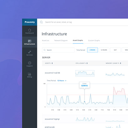
Before user interface elements like page headers and menus can be designed, it’s important to first make thoughtful decisions about the underlying structure of information on the site. This information architecture is the blueprint that visual navigation elements like menus, breadcrumbs, and tabs reveal to the user. According to the Nielsen Group, poor information architecture (and subsequently poor navigation) is “the greatest cause of task failures because it’s the stumbling block for getting anywhere on a site.” By aligning decisions about information structure and how that structure is visualized on the page, designers can ensure that both parts work together, communicating a clear hierarchy of information that can easily be explored via the user interface.
Organization is a critical ingredient for designing simple navigation systems, and to get organized you have to see all the parts and identify the patterns within your content. In her book “How to Make Sense of Any Mess” Abbie Covert says “taming any mess (requires us) to shine a light on it so you can outline its edges and depths.” A common technique used to do this is card sorting. Card sorting gets users and stakeholders to classify different types of site content in ways that make sense to them. These exercises help to develop an information architecture that is grouped by user needs and behavior patterns instead of driven by company departments and org charts.
Taming any mess (requires us) to shine a light on it so you can outline its edges and depths.” ~ Abbie Covert
As common groupings come into focus the team can begin exploring methods for how this information can be made accessible on the page in headers, menus, and links. At the most basic level navigation elements can be thought of in three chunks:
- Global Navigation gives a high level understanding of what sections exist on the site
- Local Navigation provides detail and specific links to material within a section
- Contextual Navigation includes page specific links that are relevant additions to the current content being displayed.
Designing simple navigation systems at a large scale is really all about giving users a clear set of choices for how to switch between high-level topics, explore a section in detail, or find more information related to the current topic. Simple navigation is primarily about wayfinding and presenting a reasonable number of choices at each point in the user journey. It helps users develop a mental map of the website providing signifiers of where they are, where they’ve already been, and where they can go.
Simple navigation provides just enough options to help users find a category relevant to their search. Once the’ve drilled into that category, they can compare more detailed sections to further identify the information they’re looking for. When too many options are displayed however, navigation actually creates friction. When navigation isn’t simple the user is forced to spend more time exploring poorly differentiated options than actually looking at the page content they came for. In this instance, navigation becomes a barrier, not the friendly directional assistant we need.
Simple navigation is primarily about wayfinding and presenting a reasonable number of choices at each point in the user journey.”
Many websites today offer a wealth of content but lack the navigational tools that allow users to easily find what they are looking for. By focusing on the intersection of users, content, and context, design teams can help large organizations structure their information and reveal it online in ways that are easy for users to comprehend. Simple navigation systems help users understand what is available to them sooner, and provide additional options at just the right time, improving the user’s overall experience with the website.
Does your team need a hand rethinking how users navigate your online presence? Are you looking for an experienced partner that can help you better understand your content, users, and context? Cantina has helped many large organizations address the complexities of designing simple navigation systems for large websites. Contact us today to learn more.