Improving the ROI of Cloud Services
Navisite, a part of Spectrum Enterprise, is a cloud-enabled hosting and managed applications company. We helped them create a unified design to improve the customer experience and ROI of managed IT services.

Navisite, a part of Spectrum Enterprise, is a cloud-enabled hosting and managed applications company. We helped them create a unified design to improve the customer experience and ROI of managed IT services.

When IT firms utilize products essential to calculating ROI and measuring customer value, the stakes couldn't be any higher. Cantina partnered with Navisite to deliver UX and strategic design expertise that will produce quality results long after the initial project is over.
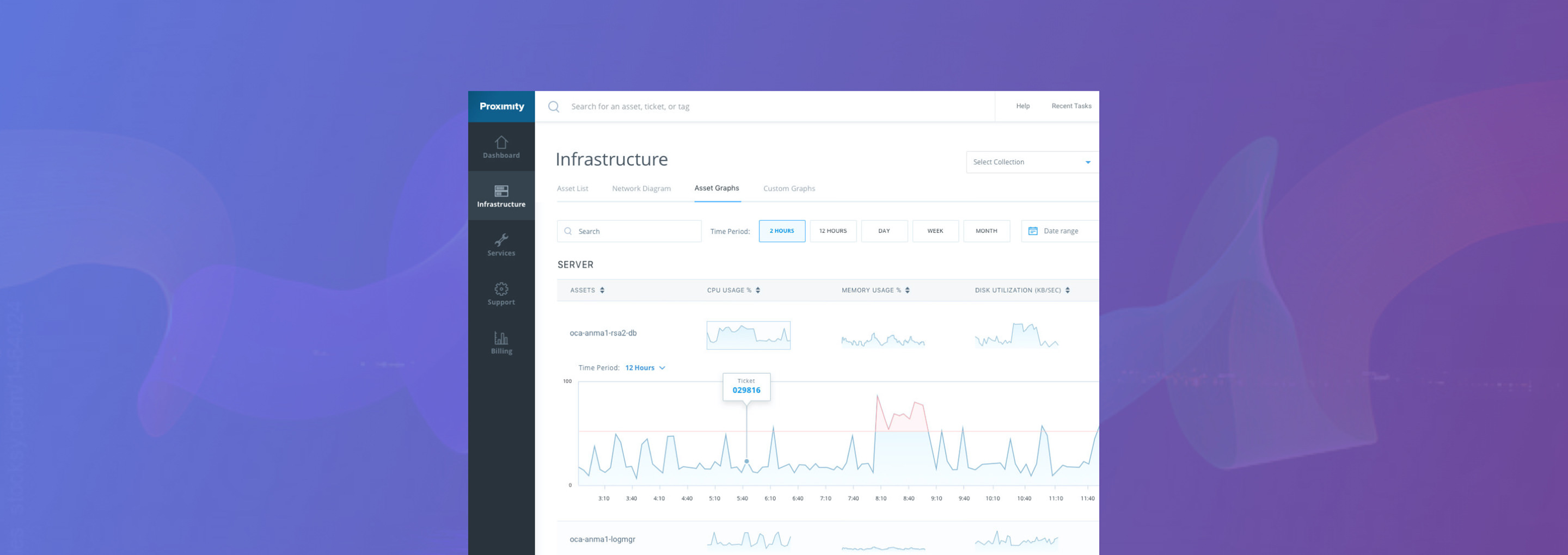
Navisite, a leader in the cloud-based managed IT space, approached Cantina about ways to improve the user experience of its most important product, Proximity. Working closely together, we redesigned the Proximity dashboard to give their clients greater visibility into the often intangible world of cloud infrastructure and IT services.
Navisite launched Proximity a year prior to hiring Cantina, effectively establishing a baseline for how customers were using it. Early customer feedback revealed the need to improve overall performance and better align the design of the portal with customer task flows and data requirements.
The new design needed to fully embrace the Information Technology Infrastructure Library, a formalized set of IT processes that Navisite was in the process of implementing across the company. The company consulted Cantina about these challenges and were intrigued by using our human-centered design approach to solve the problems, as well as our UX expertise to create a modern design.
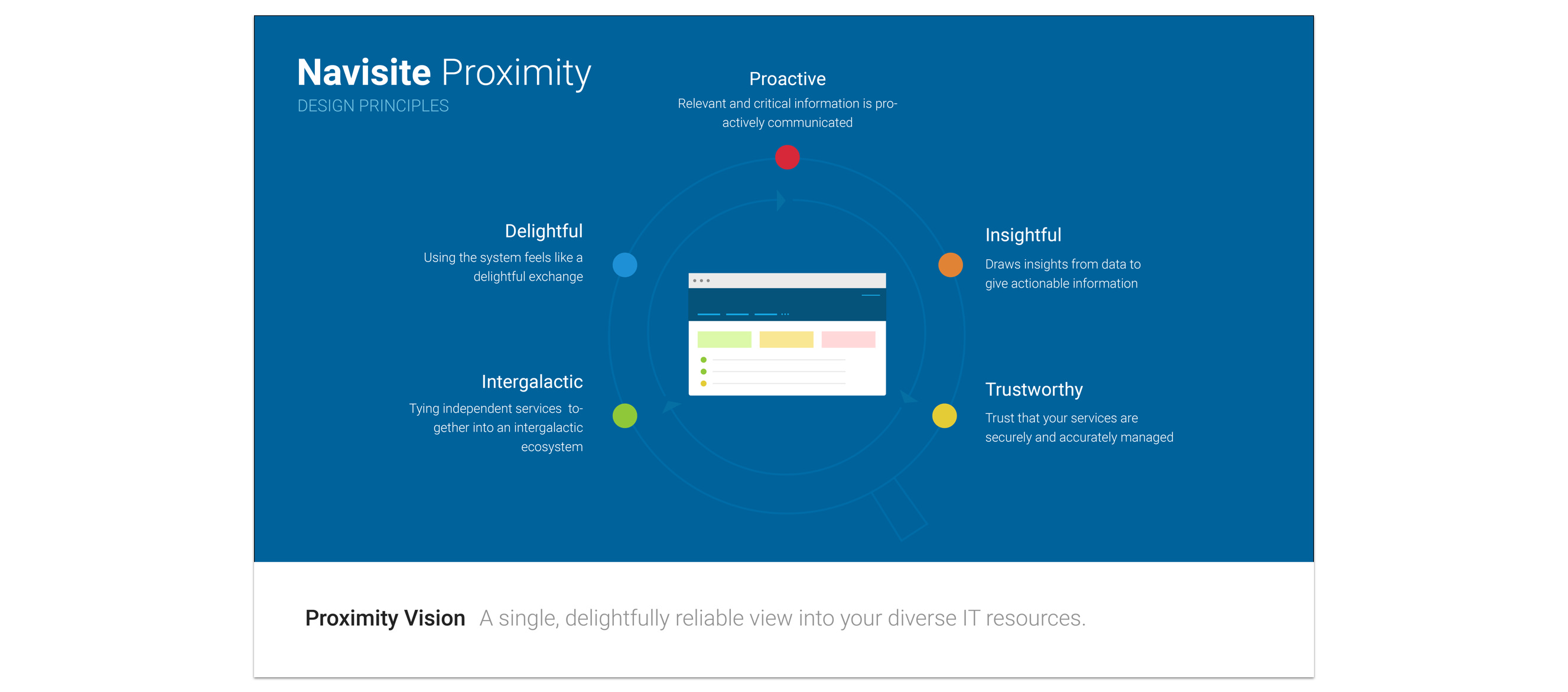
Cantina and Navisite outlined design constraints together, crafting a product vision statement, identifying technical constraints, mapping information architecture, and developing a plan for how Cantina would deliver the design.
Our team performed a heuristic review of the Proximity portal, providing Navisite a benchmark analysis of the current user experience. It helped our partner understand the current portal state and identified the areas of the experience that needed the most improvements.
Cantina conducted two weeks of stakeholder and customer interviews, allowing us to broaden our understanding of Proximity from multiple perspectives. This allowed us to truly examine Proximity’s strengths and flaws and decide where Cantina could make the most immediate impact.
Cantina used affinity mapping to capture the key attributes of the product experience Navisite wanted their customers to have with Proximity. The outcome was a shared understanding of the business needs, product vision, and design principles —identifying clear pathways to success.
Cantina provided a roadmap of the product vision and charted milestones through the design process, while staying within our timeline and technical constraints. This allowed us to communicate goals and discuss aspects of the project concisely and efficiently.
Our review anticipated a significant improvement to the portal’s Information Architecture as part of the design work. By having a broad understanding of Proximity’s capabilities and design requirements, we were able to focus our efforts on building high-value views for Navisite customers. Cantina designed data visualizations to show users proactive data about their IT infrastructure performance.

Our goal was to make Proximity a product that customers would feel is both transparent and trustworthy through the data being displayed.
The system needed to be proactive, not just reactive, in revealing important technical data, all while being easy for users to navigate and understand. Through our consulting on user research, experience design, and general product management, Navisite gained a strategic design direction to create a great end product for its customers.
We delivered a prototype with the visual design, layout, and page interaction patterns addressing the core flows of Proximity, providing a clean, concise view of interesting data points.
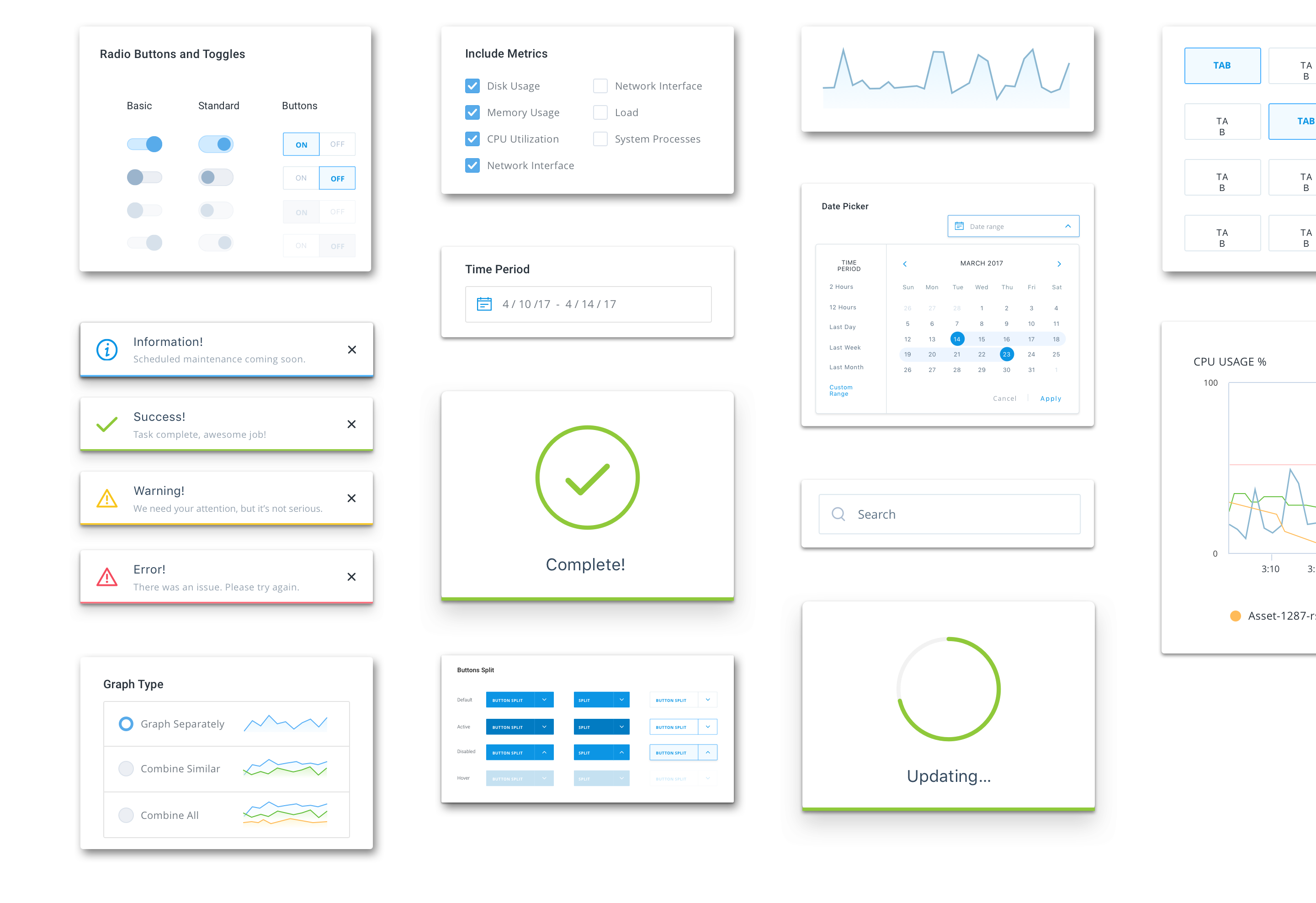
We provided Navisite the tools and UI components needed to maintain consistency throughout Proximity, allowing their internal engineering team to build off our visual design layout for future screens. This approach helps achieve a cohesive visual style that users will find both efficient and delightful to use.
The wireframes give the Navisite team a broad understanding of the potential function and capabilities of secondary sections of the portal. As Proximity continues to evolve, these low-fidelity designs will provide guidance for future user flows and features.

The hallmark of a great consulting relationship involves a high degree of trust, allowing everyone to quickly understand priorities and diagnose where the greatest impact can be felt immediately. Fueled by teamwork, Cantina delivered a revolutionary new design that offers new and augmented functionality, while leaving Navisite with the tools to add on to its flagship product at its own pace.
If you are interested in learning more about this engagement or how Cantina can help you with a project contact us today. We'd love to help.