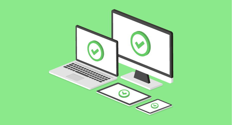

It is no longer appropriate to expect your users to sit down at a desktop computer to perform a task in one complete session, especially one that demands ten minutes or more of their full attention. More internet-capable devices are being used by more people to perform more tasks with more expectations that they’ll be able to do so regardless of the task’s difficulty or current browsing context. Simply put, the best device for your organization’s product is the one your users have at hand.
As pointed out in a previous article, there are significant gains to be made by embracing responsive Design. However, “going responsive” can be a daunting task. If you’re unsure of how to go about getting your organization to begin the process, that is something we can help you with.
Although a lot of nuance comes with a responsive redesign, there are some larger aspects of the process to consider in order to get your organization pointed in the right direction:
Getting Everyone on Board
Responsive design is as much a process concern as it is a technical one. It helps to align expectations across the entire organization before undertaking the conversion.
As a process, it can ask tough questions about how nearly all of your existing workflows function, and it fundamentally requires a change in how your deliverables are produced. Ensure that understanding occurs in every department of your organization—management sign off is key, but so is acknowledgement from your designers, developers, QA, copywriters, and even your interns.
This isn’t as simple as issuing a company-wide memo. Expect to transition to a culture of constant inter-department communication and iterating (a good thing, in my opinion). For some employees, especially ones who are used to working with or thinking about your organization’s web presence in specific way, this can potentially be a very jarring experience. Old habits, workflows, and assumptions all have the chance to be completely upended.
Setting Sail
Generally speaking, there are a few ways to go about instituting a responsive refresh:
Approach
- Target high-level, high-visibility pages or flows of the site or app first and slowly work to lower-level content pages or flows. Conversely, target these lower risk, low-level content items and then build upwards.
- Pick a single vertical section of your site or app’s structure, either high or low-risk, and move laterally outwards.
- Create or update a lower-stakes microsite as a testbed for future efforts for the main site or app.
Technology
Some organizations use a responsive redesign as an opportunity to update their underlying technologies, whereas others may elect to work with existing systems. There are numerous factors to consider in going with either approach:
- Cost: Both deploying new technology and retrofitting existing solutions can potentially take a good deal of both money and time.
- Understanding: As unglamourous as it sounds, be sure that plenty of time is allotted for thorough documentation for future work and support concerns.
- Support: Unique types of content and services, including internal and external APIs, may need extensive work to be updated.
- Consumption: Depending on their product or service, it may be advantageous for some organizations to specifically target devices or form factors that have been identified as being integral to their users. Others may want to cast a wide net and support as many devices or form factors as possible from the beginning.
Delivery
- Change the entire site or app over once the responsive redesign efforts have been completed in full.
- Progressively roll out sections of the site or app until it has been completely converted over.
In either scenario, I find that it’s best to be open and communicative about the updates you will be making. Users are notorious for reacting poorly to sudden change. Keeping them informed about the work you’re doing helps to alleviate some of that shock. This is vitally important for older sites or apps that update infrequently, who have a large number of users who may have deeply ingrained muscle memory for how to navigate and operate.
Also note that in all of these scenarios, you should be actively testing your content on a consistent basis on a range of devices and web browsers. Remember: with responsive design, a specific device (such as an iPhone) isn’t the same as a form factor (such as a smartphone).
Mind the Details
When you are conducting an audit of your content for a responsive redesign, it is important to pay attention to how every aspect of your site or app, down to the smallest sentence, will operate. Expect and plan for roadblocks and be sure to build some flextime into your roadmap to fix the tricky issues that will invariably pop up.
Remember to keep a good an eye on scope—there are a lot of potential places where the project can get hung up. A common pitfall is to perpetually push the redesign back “until it’s ready”. Setting (and meeting) realistic deadlines helps to prioritize what needs to be done in these sorts of situations.
A final thing to consider is that the concerns of responsive design can extend past the screen. Make sure to perform an audit of existing services, physical artifacts, and communication channels and ensure that they all feel natural and can function alongside your new site or app. Branding refreshes also tend to coincide with responsive redesigns, and it’s important to consider that marketing paraphernalia (guidelines, press kits, slide decks, etc.) are also updated to match.
Hopefully after reading this you have better sense of what a responsive redesign entails. Carefully consider an approach that fits your organization’s needs, then openly communicate about the process you’re about to undertake. Remember to build in enough time into your roadmap to be able to handle unforeseen issues, and be sure to mind the details.
At Cantina, we’ve worked with a wide range of organizations, including enterprise, to implement effective responsive solutions at scale. Check out how we helped Avid deliver a responsive redesign of the marketing website and a CMS re-platform to help achieve aggressive eCommerce goals. If your organization would like to see how we can help, make contact today!