The Cantina team is constantly discussing emerging tools & methodologies and occasionally these in-house conversations are so informative (and entertaining) we like to share them with a larger audience here on the blog. This particular thread begins with reactions to an article that argues true design systems must include reusable UI components in code, not just static design files. The Cantina team goes on to discuss what really is a design system, who uses them, and what value they deliver to organizations.

I like this article, but it strikes me that this is too narrowly focused on tackling the issue of production workflow. The article reads as irrefutable evidence that “if you want to improve the efficiency and accuracy of your production workflow, the boundary between design and execution must fall.” I agree with that assertion in principle, but the reality is far more complex.
The business case for addressing production workflow issues is compelling, but the reality of making it happen is a major pain point. I’m taking this position because I see clients struggle to standardize interaction patterns and experiences across a family of different products—not just the digital ones. While I agree that production-level web and mobile design components are critical, I see product teams struggling to codify and communicate how and when interaction experiences should mirror, complement, or diverge from other product interaction experiences.

Interesting Doug. You’re essentially making the argument that a “Design System” shouldn’t just be for UI components in mobile & web experiences, but it could also be a tool to documenting and building consistency amidst non-digital design experiences as well.
For what it’s worth, I have a hypothesis that senior decision makers find the value of design systems to be much more about effective scaling of products than achieving “consistency” of experience.

Doug, you raise some really interesting questions. In reading some of the HomePod reviews yesterday, I was reminded again of the Apple design process, which seemed to defer some of these questions until after a small team had produced a compelling prototype, which management approves. At this point, the larger, expert teams are brought in to address the various engineering challenges, up to and including custom silicon, needed to take the product to market. I have to imagine design evolves, but I wonder if the core vision is preserved because a small team resolved the product experience and leadership signed off, co-owning and protecting it through later phases. Is this not what we’re asking design systems to do for us? Can you have an effective system unless you also build the necessary organizational system to make it real?
I like the idea that ‘the medium of design is behavior.’ If we take this to the next step, a design system is a behavioral tool, but I suspect it won’t succeed unless we consider its organizational context.
To the point about multi-device experience, that’s a great one too. That seems to reside at Apple with the leadership team—how does AirPod relate to HomePod, etc. They came in for a fair amount of deserved criticism in The Verge’s review for limiting what it can do for what appear to be business, not customer, reasons. This implies that for a design system to support an ecosystem strategy that you need something like customer-centricity as a North Star.

The Apple example seems (at least to me) to be more about product ecosystem decisions/planning than about a “design system” as traditionally defined, but this again raises the big question of “What really is a design system.”

Sam, I agree I took things a little far afield of design systems per se. However, I’m always interested in what we’re really asking any system to do? I don’t think most organizations start from a clear conception, and so enthusiastically embrace methods or tools that then don’t result in the outcomes they envisioned.

I agree that the benefit of a design system ought not to be simply improved workflow. I don’t think you’d get any argument from senior management at a a large enterprise. The issue/the gap I’m seeing is in the method by which you express that vision. The current methodology within organizations appears to be a small committee of oracles judging the alignment of design decisions. There is little attention paid to providing feedback and tools that help people internalize the design vision. Sadly, I suspect corporations don’t prioritize this kind of communication because A) it’s hard, B) they have a surplus of financial resources that allow them to defer the decision, and C) they’re bound to deliver products that generate direct revenue.

To that end, a few questions I’d love folks' thoughts on:
- What’s included in a design system from your current perspective?
- Who are the people who use a design system and what value do they get from it?

If you're looking to build a design system for an existing product, you'll want to fully understand the entire product and its various experiences. The first step is to do a UI audit, listing all elements and grouping them by usage. You should expect to uncover some inconsistencies during this process.
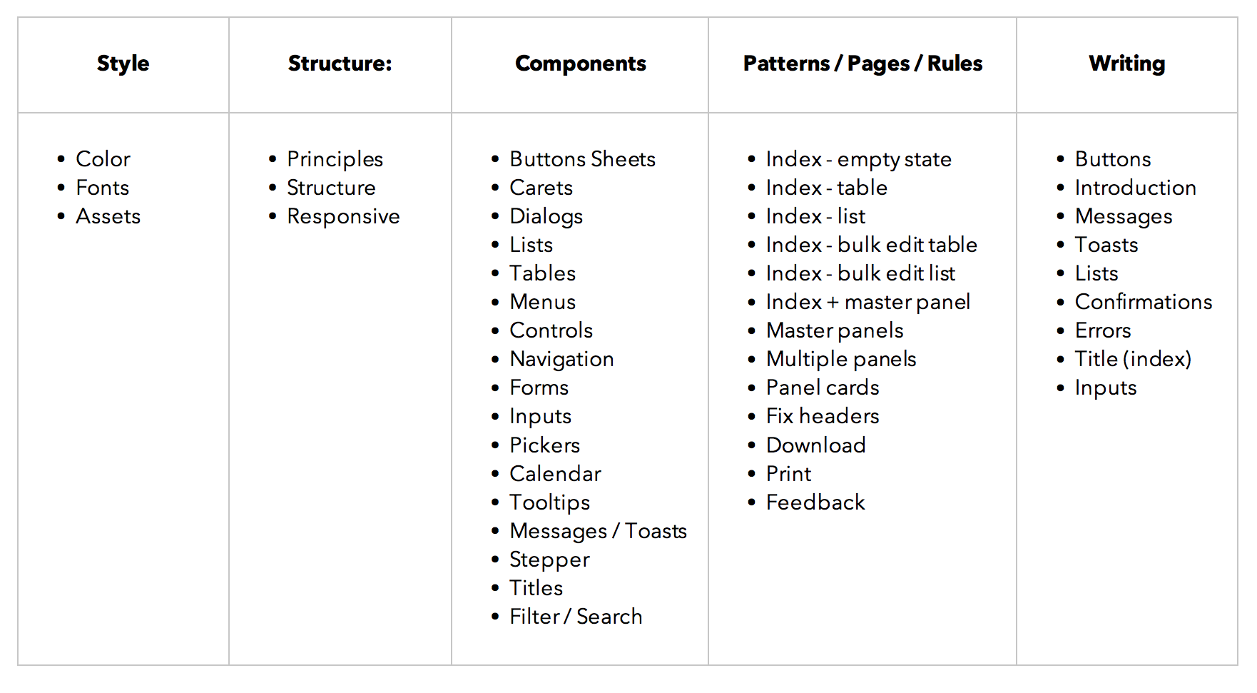
In order for a business to manage design at scale, decisions will have to be made about many of the UI elements shown below. Codifying consistent components across theses areas will help your team become more efficient when building future features.


I view design systems as the language and grammar of an organization—spoken not only to the outside world, but (perhaps more importantly) internally. My view is that without enacting it effectively, you’re appearing to the world as inarticulate. It might not be a direct thing that people pick up on, but it will affect how they operate and interpret your project.
A tooltip is as much a component of a design system as a logo on the tail of the plane. What is more important is why it’s there, how you talk about it, and where does it fit into overall organizational goals.
The other interesting thing to me is all the conversations around the flourishing of tools to assist with the ergonomics of creating a design system, which are effectively improvement on tools that are already there. In part, that’s because of the relative newness of the idea that digital design is flows, not pages, but it’s not doing anything that other industries have not already been doing at scale for years (semi-autonomous car factories are a design system, for example, same as McDonald's line prep process).
We can obsess over how we built variables for our rounded corners, but unless your system is in the service of a viable end result, you’re just bikeshedding. Nobody wants a broken car with a really excellent paint job the same way nobody wants a Juicero even though it has incredibly well-machined parts.

Thanks all for the great thoughts. I think we’ll continue to see the topic of design systems discussed and debated amidst the organizations we work with. Many companies are recognizing that a good design system lets small UI decisions be solved once, freeing up designers and developers to focus their time on the people & problems their product serves.


