The Challenge
At Cantina, technology is at the heart of what we do. We know that we’d be hard-pressed to find an area of daily life that is not augmented by or reliant on computers or communication systems. Software has become the civil infrastructure upon which lives are built. Unfortunately, cybersecurity isn’t paid as much attention as it warrants; it is an integral part of our lives as both creators and digital citizens. We believe that it is the duty of digital citizens everywhere to participate in conversations around privacy and security, both in the work they perform and personal lives, so that we may work towards a more secure and security-conscious world.
We at Cantina always seek to maintain this mindset in the work we do, and we even have an internal working group to keep a watchful eye on what is going on in the cybersecurity arena. When OpenIDEO announced a design competition that asked participants to redefine the intersection of data privacy and design, a colleague of ours who keeps their ear to the ground on exciting competition opportunities stumbled upon the challenge. They brought the idea to a few designers and engineers who’d expressed an interest in working in this problem space, and a whole host of Cantinistas were eager to jump in. We decided to put together a small team to pool our diverse sets of expertise and take on the design challenge.
OpenIDEO set the stage for the competition as follows:
We live in an age of immense connectivity. The devices we use to communicate with one another, the complex systems which enable how we move through the world, be it by plane, automobile or subway system, the cloud where our most private data is stored and the networks which safeguard our hard-earned money.
Unfortunately, the current visual communication surrounding Data Privacy and Security has not risen to the challenge, so the competition they posed to the public was this:
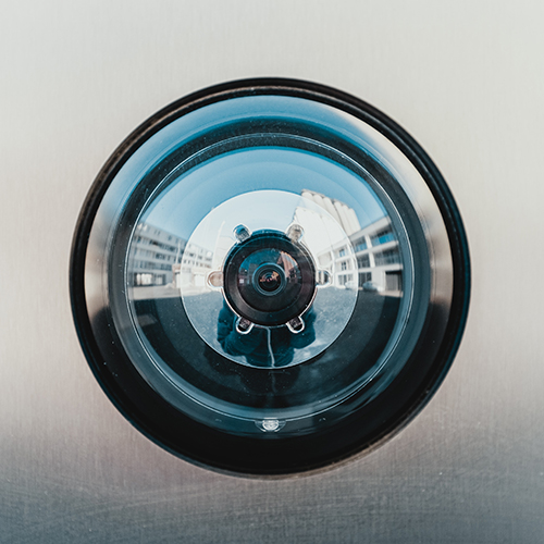
Too often, visuals in the cybersecurity space reflect surface level understanding influenced by sensationalist media. We see pictures of locks, white men in hoodies, or green 1s and 0s that do little to convey the reality of this complicated, critically important topic. With this Challenge, we hope to elevate imagery that better represents the cybersecurity space in an accessible and compelling manner. -OpenIDEO
Our Solution
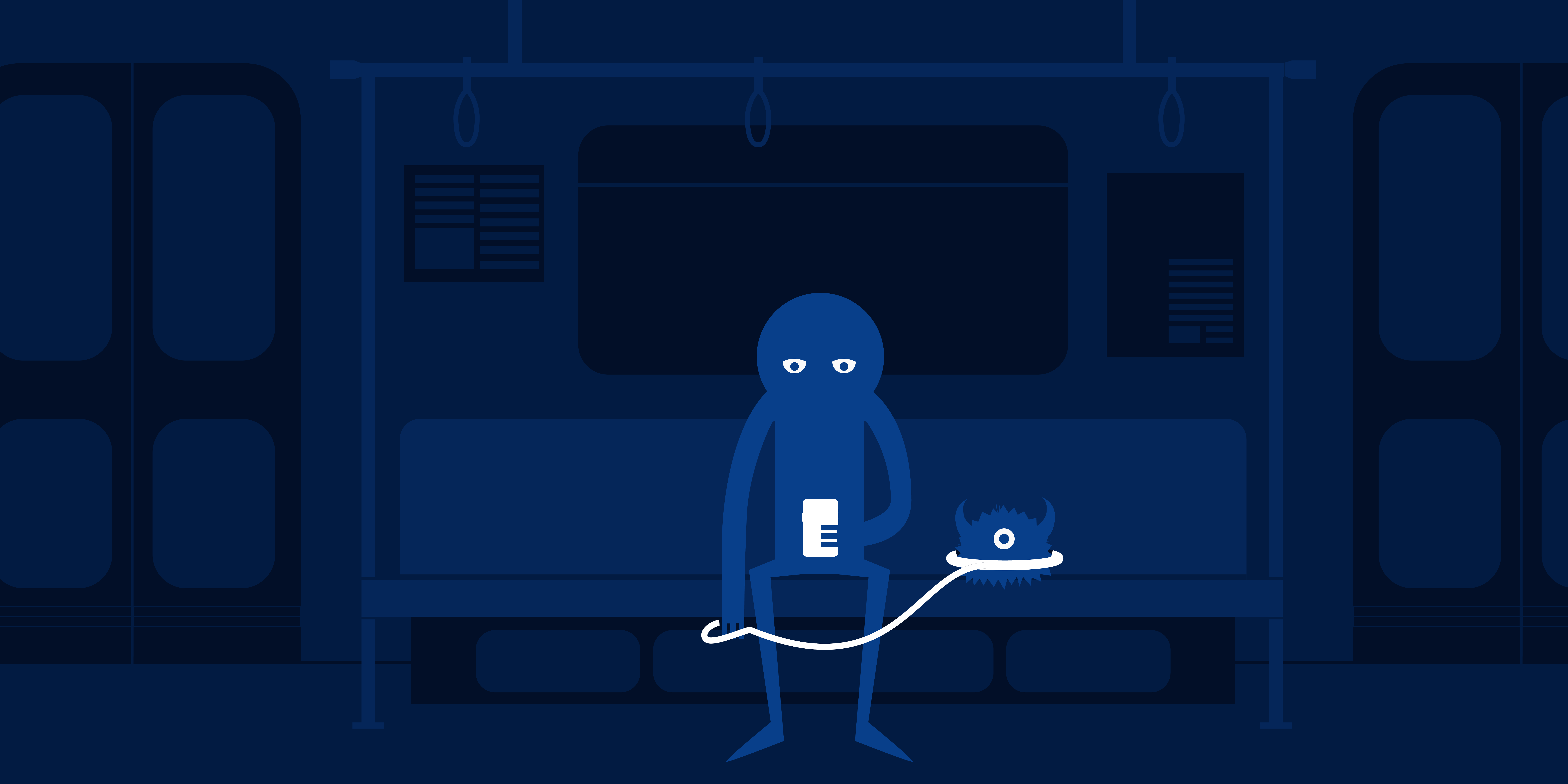
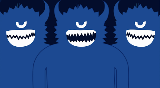
Creeping data critters: a cautionary tale of keeping lurking security monsters at bay.
Our team from Cantina consisted of Amy Perelberg, Dakota Kim, John Hurley, Katrina Stropkay, Matthias Ferber, and Virginia Wood: a mix of designers, strategists, and software engineers. In our daily work, we work to design and build digital products that matter.
Our submission was an animated storyboard telling a cautionary tale about surveillance. The story follows a user who is signing up for a new app or service, or posting on an existing service, and is prompted with a sequence of permission requests. The user blindly agrees to share the requested information - a habit that has become far too common - and suffers terrifying consequences. In our animation, we hope to educate users of technology by illustrating the risks that come with giving away your personal data. This playful dramatization explains how consenting to seemingly innocuous tracking agreements can lead to unpleasant outcomes. We want to leave viewers with the message that they have some power, through their choices, to keep the lurking security “monsters” at bay.
Refining Our Idea Through Teamwork
Our original submission revolved around the simple idea of a monster as a metaphor for the consequences of misused data. Early on we had the notion that a flashlight could act as a mechanism to shine a light on this issue. Using a simple GIF animation we explored the idea of a monster in a dark room representing large data-collecting organizations. When a flashlight shines on the monster, an x-ray-like reveal shows that its body is entirely made up of small pieces of personal data.
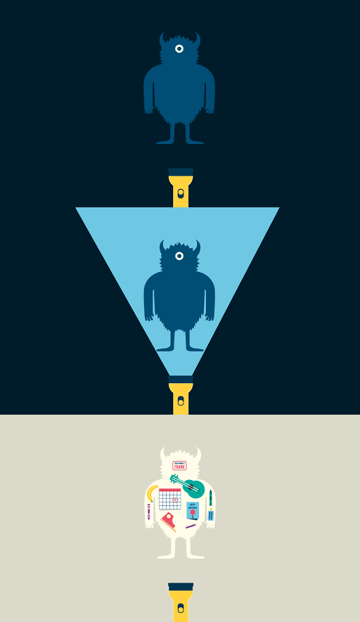
We had the opportunity through the competition to pitch our concept to Google UX Design Lead Burton Rast. During a mentoring session, he challenged us to include multiple monsters to improve the technical accuracy of the piece. Mr. Rast also proposed that we minimize fear-mongering and, instead, emphasize positive, informative lessons for the viewer to draw. We also solicited input from Cantina’s internal cybersecurity experts. Upon further consideration, we realized that our story arc was lacking key components, such as a tipping point, a moment where the character discovers the danger, and a resolution. Some questions we began to ask ourselves were:
- How did the monster come to be?
- Does the misuse of data start out small and grow into a larger problem?
- What are the sources or points of interaction with technology that lead to misused data?
- How did our user give away their data?
- What happens to our user after the monster grows to full size?
- What is the message we want our audience to take away from this story?
In order to answer these questions for our audience, we knew we needed to take a critical look at our foundational storyboard. One practice that helped in the development of our story was continually reviewing, analyzing, and reconsidering the scenario as a group. Having multiple eyes on the storyboard gave us the ability to iterate quickly and pick out key missing or misleading elements.
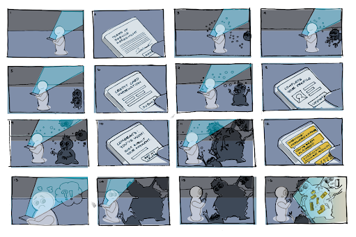
During group brainstorming sessions, we were able to land on simple yet poignant plot milestones, such as having our character turn around and be knocked over by the data monster itself.
The Outcome
Though we did not win the competition, we were proud to be included as one of the Top 25 finalists, and were lucky enough to be mentioned in an IDEO Octopus newsletter article titled 8 Designers’ Tips for Better Visual Storytelling. The article highlights our very own John Hurley, but we can’t emphasize enough how essential collaborating as a team was to our success on this project. Consulting with subject matter experts, co-workers, and friends was integral to addressing the key societal and technical security issues our story grapples with. Without collaboration, our piece would have lacked both technical accuracy and the all-important narrative that makes it both engaging and relatable. Our final submission was enriched by multiple viewpoints and explorations of our topic in ways that are simply impossible to accomplish on one’s own.
We thought it was important to form a team in this competition because we live in a time when we’re all part of the cybersecurity conversation. As users, we have a say in today’s fast-evolving landscape of vulnerabilities, data breaches, and sophisticated cyber attacks, and if we want to create a security-conscious culture, it’s crucial that we convey that to people. Sharing data, for instance, is not inherently wrong, but people are too often unaware of the risks associated with data usage and storage. Organizations hide behind lengthy and inaccessible terms of service instead of doing due diligence to protect sensitive user data and informing their users appropriately. Using an abstract and accessible style, our story conveys these risks and the situations poor data security can lead to, and reminds users that the data they share can be leaked and combined with other data and turned into a monstrous loss of privacy.
As users, we have a say in today’s fast-evolving landscape of vulnerabilities, data breaches, and sophisticated cyber attacks, and if we want to create a security-conscious culture, it’s crucial that we convey that to people.
As users, we have a say in today’s fast-evolving landscape of vulnerabilities, data breaches, and sophisticated cyber attacks, and if we want to create a security-conscious culture, it’s crucial that we convey that to people.
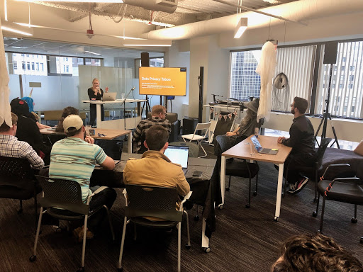
After the challenge ended, our team saw an opportunity to further the awareness created by the competition, within Cantina itself. Our team took the reins at one of our weekly design team meetings to dicuss what we had created, how we worked, and what we learned. In addition, we used the information we’d collected during the project to put together two fun games for our co-workers, in hopes of driving our message home and creating something entertaining and memorable to wrap up this journey.
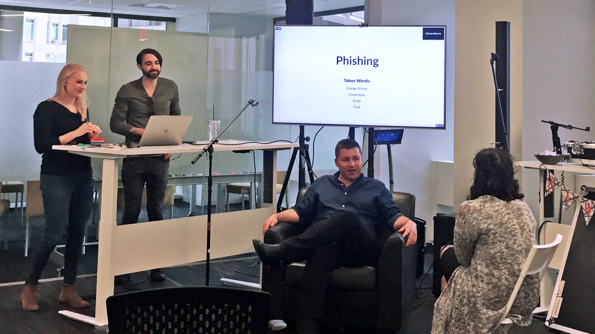
First, we created a custom game of Taboo that used only data privacy and security-related terminology. The teams performed exceedingly well and it opened up a discussion that helped the crowd better understand some of the language and metaphors that define the vocabulary of cybersecurity. Second, we devised an exercise in which teams were each given one image from another OpenIDEO finalist’s entry. We challenged our co-workers to try to discern the submission’s intent from the visual alone, and then to pitch their best guess to the rest of the group as if it was their own idea. The activity provided an entertaining and insightful look into people’s impressions of the ways cybersecurity concepts can be represented visually. Of course, to end the exercise, we awarded our winners with an appropriate prize: webcam covers for each team member.
Overall, this project demonstrated the value of operating in cross-functional teams and taking advantage of the unique strengths each of us contributed to put together a product more impactful than anything we could have created as individuals. We look forward to the next opportunity to take on a joint design challenge like this one, and we highly recommend a project like this for any organization looking to boost their knowledge, collaboration, and — above all — creativity in the face of tough design challenges.
Working on an innovation or data privacy & security challenge of your own?_ _We’d love to hear your opinions or work with you_ to make your ambitions a reality!
The views and opinions expressed in this blog are those of the author(s) and do not reflect the official policy or positions of Cantina or any other agency, organization, or third party. The author has no current affiliation with IDEO or any featured artists/designers.
