
Many websites are slow because they require a large amount of data to be downloaded. We can’t control our customers’ internet speeds, but we can control the efficiency of the content we provide.
In this post, we will look at ways to reduce page load time and make our websites faster. If you are not familiar with the page load time metric, I recommend reading the first post in this series where we looked at ways to evaluate the performance of your website or web app.
Page load time is exactly what it sounds like – the time it takes to load a web page. In Part 1, we mentioned the definition of “finished loading” depends on the nature of your website:
- A basic static website finishes loading as soon as all of the static data (HTML, CSS, and images) has loaded.
- A simple WordPress website finishes loading after all static data has loaded, database queries are complete, and all content is displayed on the page.
- A more complex website or web app may not finish loading until all asynchronous requests have completed.
Our definition of “finished loading” shifts even more when we consider prioritizing content above-the-fold, perceived performance, progressive enhancement, and other techniques that we will discuss in the future.
Regardless of what type of website you have, addressing poorly optimized static assets such as HTML, CSS, JavaScript, and images can be the easiest, fastest, and most cost-effective way to improve performance. For these reasons, and to keep this post from wandering across too many topics, we will focus on optimizing your static assets by:
- enabling gzip compression
- optimizing images
- minifying CSS
- minifying and uglifying JavaScript
Enabling Gzip Compression
Compressing a file reduces its size by replacing characters and patterns of data with references and symbols. The smaller files require less time and bandwidth to download, benefitting both the server and the client. After receiving a compressed file, the browser must decode it in order to convert the symbols and references back into executable code. This process introduces additional overhead, but it is negligible compared to the savings achieved from transferring fewer bytes across the network.
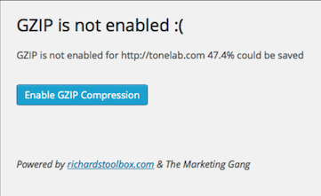
GNU Gzip (colloquially referred to simply as “gzip”) is an open source application for lossless compression, which means you don’t lose any data by compressing and decompressing a file. It does not provide the best compression ratio, but it is fast – which is very important when you are encoding and decoding files on the fly. It is also free and well established, making it the most commonly used compression tool for the web. All modern web browsers support gzip, so you should be okay to use it unless you need to support Internet Explorer prior to version 5.5. There are many online tools that will check if your website is using gzip compression. I recommend PageSpeed Insights by Google as it gives a lot of useful performance suggestions – not just gzip compression. You can also check the Network tab in DevTools to see if a resource is using gzip compression.
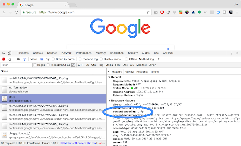
Checking Resources for Gzip Compression Using Google Chrome
- In the Chrome browser, open DevTools (CTRL + SHIFT + I on Windows, ⌥⌘ I on Mac).
- Select the Network tab in DevTools.
- Navigate to a website.
- Click the name of a resource in the list.
- Under the Headers tab of the window that appears for the resource, check for
Content-Encoding: gzipunder the Response Headers section. - If
Content-Encoding: gzipis set in the response header, then gzip compression is enabled for that mime type.
If the statics assets for your website are not being served with Content-Encoding: gzip, you can enable gzip compression for text, HTML, XML, CSS, JavaScript, and SVG (SVG is essentially XML at the file level, but I like to call it out separately).
If you are not comfortable with server configuration and your website is running on a modern CMS, then enabling gzip compression may be as easy as installing a plugin or checking a setting in the GUI. For example, WordPress administrators can install the Check and Enable GZIP compression plugin for WordPress, click a button, and voilà – gzip compression is enabled!
For the rest of us, we will need to set some configuration options on the web server. The necessary settings depend on what web server you are running. I am most familiar with Apache2 on Ubuntu, so that is what I am going to use for the examples. You will want to refer to the documentation if you’re using a different web server or OS.
Configuring Gzip Compression in Apache2
The steps below assume you have full access to the web server. If you do not have permissions or are on shared hosting, you may need to request that mod_deflate be enabled and configure it with .htaccess in the root of your website.
The first thing we need to do is make sure mod_deflate is enabled as this is the module that provides the DEFLATE output filter needed to compress files before sending them over the network. It should be enabled by default, but you can check the mods-enabled folder to verify that it is enabled. If the following command prints results for deflate.load and deflate.conf then mod_deflate is enabled:
ls /etc/apache2/mods-enabled | grep deflate
If mod_deflate is not enabled, you can enable it in Apache2 with the command a2enmod deflate. If it looks to be enabled, but is not working, open /etc/apache2/mods-enabled/deflate.load and make sure LoadModule deflate_module /usr/lib/apache2/modules/mod_deflate.so is not commented out.
Next, we need to configure mod_deflate
nano /etc/apache2/mods-enabled/deflate.conf
and enter the desired mime types to compress
<IfModule mod_deflate.c>
    <IfModule mod_filter.c>
            # these are known to be safe with MSIE 6
            AddOutputFilterByType DEFLATE text/html text/plain text/xml

            # everything else may cause problems with MSIE 6
            AddOutputFilterByType DEFLATE text/css
            AddOutputFilterByType DEFLATE application/x-javascript application/javascript application/ecmascript
            AddOutputFilterByType DEFLATE application/rss+xml
            AddOutputFilterByType DEFLATE application/xml

            # Apache doesn’t know the mime type for SVG, so we need to add it
            AddType image/svg+xml .svg
            AddOutputFilterByType DEFLATE image/svg+xml
    </IfModule>
</IfModule>
then restart Apache
sudo service apache2 restart
You’re now set up to use gzip compression! You don’t need to do anything differently in your code. The browser will send an Accept-encoding: gzip, deflate header along with the request, then your server will gzip the requested file before serving it to the browser.
Image Optimization
There is not a one-size-fits-all solution for optimizing images like enabling gzip compression on your web server. You could automate image processing in a build script to optimize images with a tool like ImageMagick, but this isn’t always a great solution. The build script won’t know what size you need each image or how to crop them to get an ideal frame of a photograph.
Instead, we need to optimize images as we add them to the website. This sounds like a bad thing at first, but I prefer it because it promotes mindfulness. When you are aware of how your website performance impacts your customers’ experience, you will choose a small number of images that provide value over many frivolous images.
The first step to reducing an image’s file size is to resize and/or crop it to the desired dimensions rather than shrinking the displayed size with CSS width and height. If you need to display an image at 250x250 pixels and your source image is 1000x1000 pixels, then you may just want to resize it. If your source image is 1280x1024 pixels, then you need to crop it and then resize it. Take this opportunity to re-frame the image for the best presentation.
With a 1000x1000 pixel source image, your first inclination may be to resize the image to 25% of its original size to get down to 250x250 pixels. This would work, but the image wouldn’t be as sharp on today’s high pixel density devices. At the time of writing, the usual rule of thumb is to create three versions of each image: 1x, 2x, and 3x the desired dimensions.
There are different schools of thought when it comes to naming files, but I like the @density nomenclature (i.e. @2x = two times the pixel density). Typically the 1x version has a common filename like logo.png and the 2x and 3x versions are denoted in their filenames such as logo@2x.png and logo@3x.png. For our scenario, logo.png would be 250x250 pixels, logo@2x.png would be 500x500 pixels, and logo@3x.png would be 750x750 pixels. We want the 1x image for older devices or for slower networks. The 2x image is ideal for retina displays and the 3x image is for higher pixel density mobile devices.
Using the Vauxhall logo as a reference, let’s take a look at the difference between 1x, 2x, and 3x pixel densities. The first image below will look somewhat blurry on high pixel density displays, but the second and third will look much more crisp.
logo.png (250x250 source displayed as 250x250 pixels)
logo@2x.png (500x500 source displayed as 250x250 pixels)
logo@3x.png (750x750 source displayed as 250x250 pixels)
In order to support older devices and to allow the browser to choose the highest resolution based on the browser and/or device settings, we use a combination of src and srcset properties.
You are probably familiar with using the src property to define the image source URL for an <img> tag. The srcset property was introduced as part of the picture specification, giving authors the ability to give hints to the browser about which image source should be used based on screen pixel density.
The srcset can also be used with a width descriptor, but I prefer using the pixel density descriptor to present the best quality image across any device. There is also a sizes property that can be used with <img> or <picture> to tell the browser what images to use based on screen size. However, this is more of a design use case where you may want to use a different version of an image (such as cropping it differently) for different screen sizes which is another topic altogether.
Getting back to our logo example, we provide a 1x, 2x, and 3x pixel density image below.
<img src="logo.png" srcset="logo.png 1x, logo@2x.png 2x, logo@3x.png 3x">
The Vauxhall logo using srcset for pixel density
If the browser prefers a 3x or 2x pixel density, it will choose one of those to fetch and display. Otherwise it will load the 1:1 pixel ratio image. If the browser does not support srcset, it will see the src property and load that image instead. This approach is preferable to giving everyone the 3x pixel density image because the browser will not need to download the higher quality (and therefore larger file size) image if the device does not support or prefer that high of a pixel density.
According to the W3C specification on embedded content, browsers may be able to implement network speed heuristics to determine the best image to use in a srcset in the future. Web performance geeks have been dreaming about this since 2014, but it has yet to be implemented.
Once our image is cropped and resized to the appropriate dimensions, we can run the image through a tool such as ImageOptim to optimize it further. ImageOptim removes metadata – information about the image as a file – and other extraneous content from the image before compressing it in order to reduce the file size.
Simply drag and drop the files into ImageOptim and it immediately begins optimizing them.
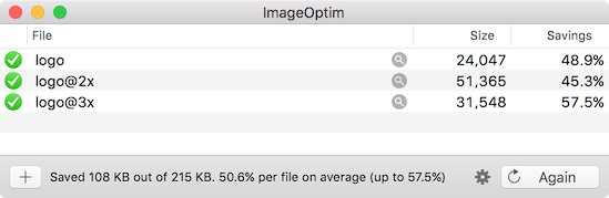
Now our logos are fully optimized without any noticeable loss in quality!
Minifying CSS
We are now using gzip compression for all of our static assets, which includes CSS files. We can get even smaller file sizes by minifying the CSS file before the gzip compression step.
The minification process removes everything that is nice for human readability, but not important to the CSS parser such as whitespace, comments, repeating hex codes (#ffffff becomes #fff), and so on. Each character takes up a full byte of space, so this process can reduce the file size quite a bit if you have a lot of comments or whitespace in your stylesheets.
CSS minification is usually performed during the build phase for web applications. If you don’t have a build script for your website, you can use an online tool such as Minify or install a command line tool like clean-css or minifier. You can do some fancy things with clean-css in a build script, but there is also a command line utility named clean-css-cli that is dead simple to use:
clean-css -o styles.min.css styles.css
Minifying and Uglifying JavaScript
We minify JavaScript in much the same way as CSS. The minification process removes whitespace, comments, and unnecessary semicolons. We can even use some of the same tools (Minify and minifier also work with JavaScript).
One downside to minifying JavaScript is that removing the whitespace results in all of the code being on one line, making the line number in error logs less than useful. After all, “error on line 1, column 187463” is not terribly helpful, especially when viewing a large minified file in DevTools will wrap lines by default. Fortunately, sourcemaps alleviate this by allowing you to view the original source files in DevTools.
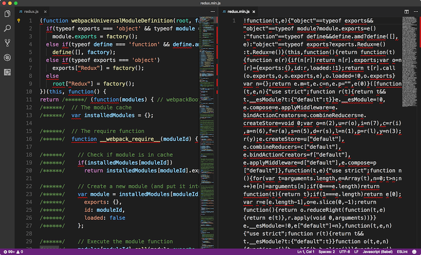
We can further optimize JavaScript by uglifying it. Uglifying is different than minifying in that it obfuscates the code by “mangling” variable and function names, such as converting them into very short names that have no semantic meaning.
Most uglify tools take scope into account, which means it can reuse the shortened variable names, resulting in a lot of one-character names. The process does not modify the content of strings or anything else that would affect the behavior of the code.
Uglifying makes the code quite difficult to read but it also reduces the file size since fewer bytes are needed to represent the shorter names. For example, using UTF-8 encoding, the letter t is 1 byte and mapStateToProps is 15 bytes. Uglifying a large source file can result in a lot of savings!
There are some utilities such as uglifyjs that perform both the minification and uglification, making it quite simple to use or integrate into your build. You can even bundle multiple source files:
uglifyjs src/script1.js src/script2.js --output dist/script.min.js --compress --mangle
Since uglifying code makes it next to impossible to debug, it is recommended that you only use it for production code. If you do uglify the code in your development environment(s), you can create sourcemaps for debugging. This is as simple as adding the --source-map parameter to uglifyjs.
uglifyjs script.js --output script.min.js --compress --mangle --source-map
It is generally not recommended to use sourcemaps in production if there are security concerns with allowing anyone to view your source code. It is possible to have private source maps, but that is outside the scope of this post.
Next Steps
We can be good stewards of the web by being more mindful about how we serve content and build applications. The first step is reducing the footprint of our code, using appropriately sized images, and enabling compression of static resources. Together, these optimizations can go a long way to improving the user experience.
Coming up next, we will look at ways to improve the Time To First Byte (TTFB) using a Content Delivery Network (CDN) and other strategies.