As the software we build gets more and more complex, it gets more and more difficult to talk about how it all should work. How many times have you talked with your team about what should change in a system, only to find the group lost debating how it works right now? Without guideposts for your discussion, it’s easy to lose your way.
We use sequence diagrams to help engineers communicate about systems and processes. Sequence diagrams show components of a system and the messages they send to each other over time. Time flows top to bottom, and messages are passed horizontally. Laid out in this way, systems and processes can be illustrated with just enough formality to be clear to readers while still being quick to sketch. They let both engineers and stakeholders come to an understanding of the system and find problems before any code is written.
At Cantina, Sketch rapidly became the swiss Army Knife of visual and experience design. In this post, I’ll demonstrate how to create sequence diagrams in Sketch. After building a few, you’ll find that you can create them collaboratively during engineering discussions, building shared understanding within the team.
Artboard Management
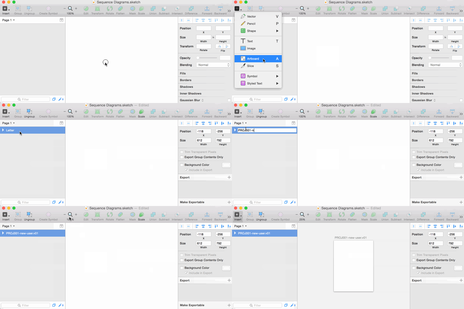
In Sketch, the artboard represents a printed page or slide in a deck, laid out flat on a workspace. Although we can begin drawing without an Artboard, I find it helpful to set the boundaries of the diagram up front.
How-to:
-
Insert/Artboard - type A
- Choose Letter or A4, whichever is standard for your region.
- Pick landscape orientation if you plan on diagramming more than 6 roles.
- Double click the new artboard in the Layer List on the left and give it a name.
If you zoom out, you’ll see the outline of our blank page in a workspace. As we add more pages, they will fill out this workspace in all dimensions. For us, we’re likely to create PDFs of individual pages and occasionally print them out for reference. It would make sense for us to have one artboard per process, cloning them to new artboards when we revise them later on.
Note: The Artboard name will become your filename if you export a single diagram as a PDF. If you have any other naming conventions in your project, now’s the time to think about that. An example from a convention I’ve used is: PROJ001-new-user-v0.1 The order your artboards appear in the Layer List on the left is the order they will appear in your output if you export many at a time.
Later on, when you have more than one artboard, you can quickly navigate between them by selecting one in the Layer List and pressing Command-3.
Role Tracks
Role tracks are the participants in your diagram. They will be activated by messages, do work, and send messages to other roles. In a sequence diagram, role tracks are timelines labeled with the service, module or class showing the reader the components of the process you’re demonstrating.
For example, if you wanted to show a browser requesting a page from a webserver, you might see:
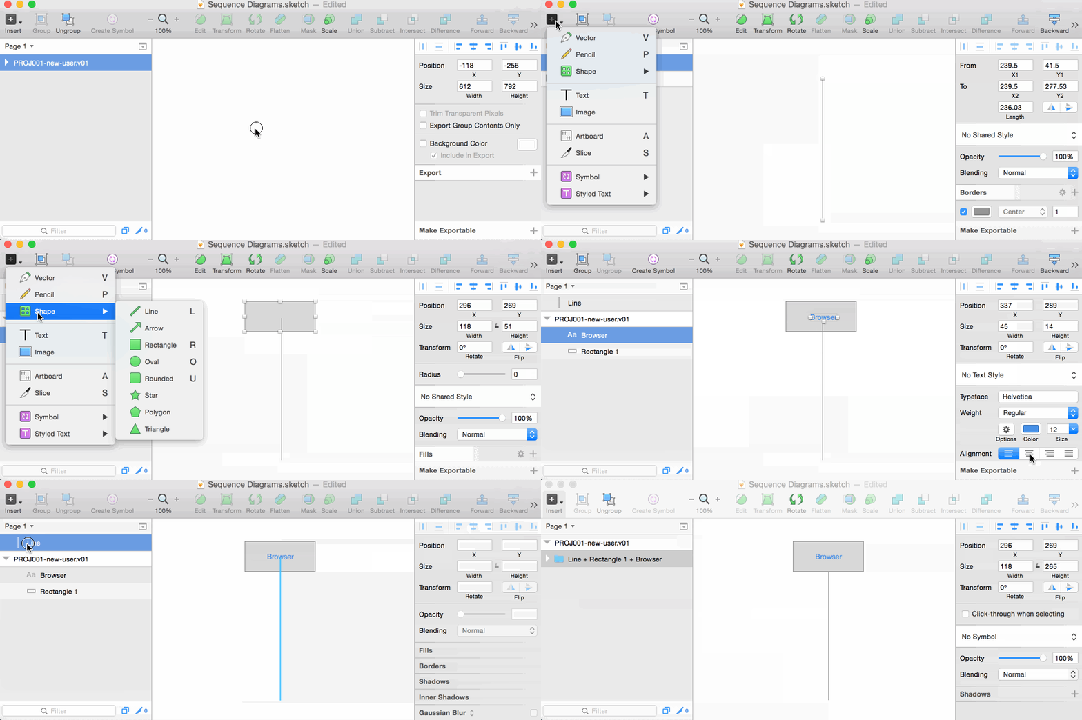
Here we lay out a few of them allowing you to draw events on top of them.
How-to:
-
Insert a line - L
- click and drag, hold SHIFT and extend straight down
-
Insert a rectangle - R
- click and drag
-
Insert text - T
- click and type
- choose center alignment for the text
-
Arrange them
- Select all 3 and align them horizontally
- Select the rectangle and text and align them vertically.
- Hold SHIFT and drag them to the top of the line
- Select all 3 and group them - Command G
You’re going to need more than one, so hold ALT and SHIFT and drag it to the right
Finally, select them all and group them.
Tracks are your canvas, once you’ve set them up you’ll want them to stay out of the way. Right click on the group in the Layer List and lock it.
Activation Boxes
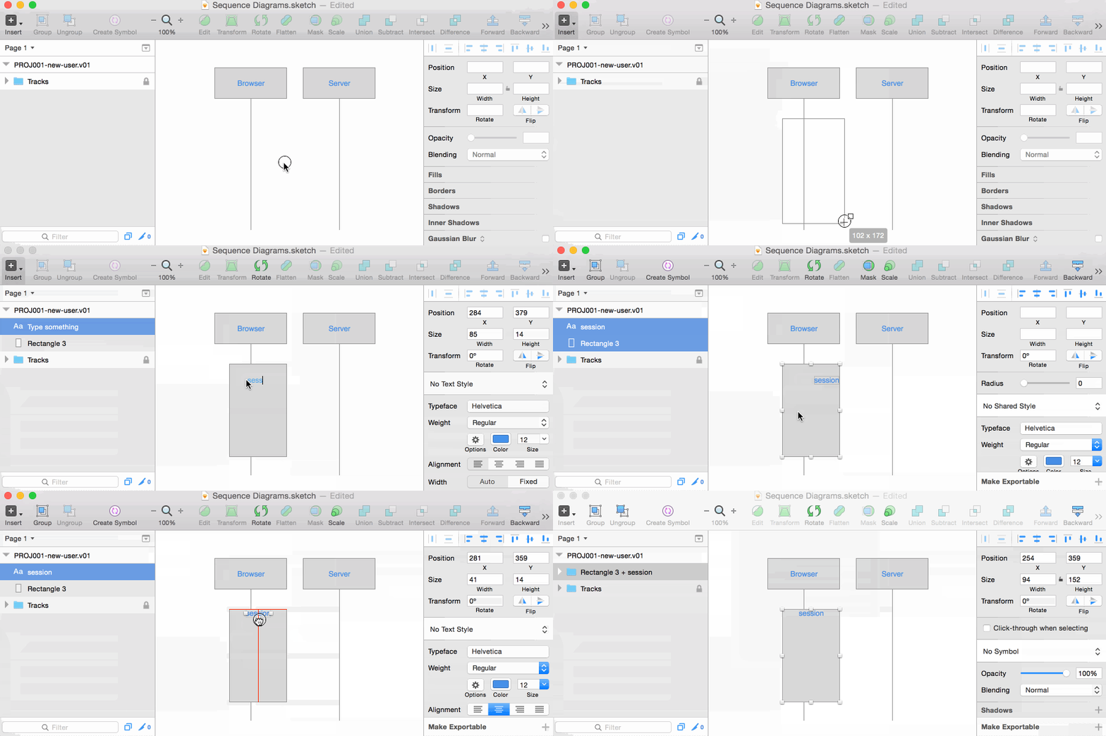
Activation boxes represent a process or context that is executing on a Role Track. In their simplest form, they are plain rectangles. I find it helpful to label them for additional context on the method involved.
How-to:
-
Insert a rectangle - R
- Click and drag
- Make sure your rectangle has a 100% opacity fill, so that it hides the timeline.
-
Insert text - T
- Click near the top of the rectangle and type
- Choose center alignment for the text
-
Arrange them
- Select both and align them to be centered horizontally
- Group them - Command G
Sizing:
Since they are grouped, if you want to change the height of the rectangle, double click on it to select the rectangle within the group. Now when you drag the bottom handle, the text remains in place.
Template:
This is most likely not your only Activation box in this diagram. To clone it, make sure the whole group is selected and hold ALT while you drag to the new location. Double click on the label twice to begin editing the text.
These labeled Activation boxes can be used to show additional detail within a timeline. I’ve stacked them like a flame chart to imply function calls. This can come in handy when the scope of your diagram spans from whole systems down to method names.
Message Arrows
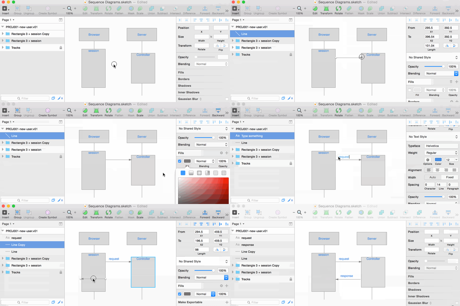
The last component of these diagrams is the message arrow. They represent a communication from one component to another. Sequence diagrams can include all manner of message arrow styles, including dashed and solid lines, filled and unfilled arrowheads. I’ll start with the filled, solid arrow.
How-to:
-
Insert arrow (found under the Insert / Shape submenu)
- Hold SHIRT, click and drag from left to right.
- Style the arrow to have a fill (disabled by default)
- Choose your border color to be the same color.
That’s it. Because these arrows and labels are so frequently tweaked and changed, I don’t group the labels with the arrows. I recommend using the same font and size for all labels for consistency. Once you have one label set up, Alt-drag it to clone it for more.
Changing their length/direction:
Double click on the arrow to enter Node Edit mode. Hold SHIFT and drag the endpoint to the correct location, even to the left.
Again, you can clone them by ALT-dragging them around.
Bookkeeping and Beyond:
Your diagram is likely to have a name, so you might as well title it with a text label centered at the top of the page. Adding a version number and last modified date helps you piece together the history of this feature later on. Finally, you might like to keep another text area near the bottom of the page for notes, describing the changes in assumptions made since the last revision.
The above examples is just a hint at some of the things you can do with Sketch to make your life with diagrams a little easier. Given that Sketch is a full-featured design tool with an ever-growing library of plugins, it’s easy to think about new ways it can make work life more productive. Do you use Sketch in a different or unique way? Tweet us your thoughts at @cantinac.
![Sketching for UX Designers [Infographic]](/images/blog/2015-12-02-sketching-for-ux-designers/square.jpg)
