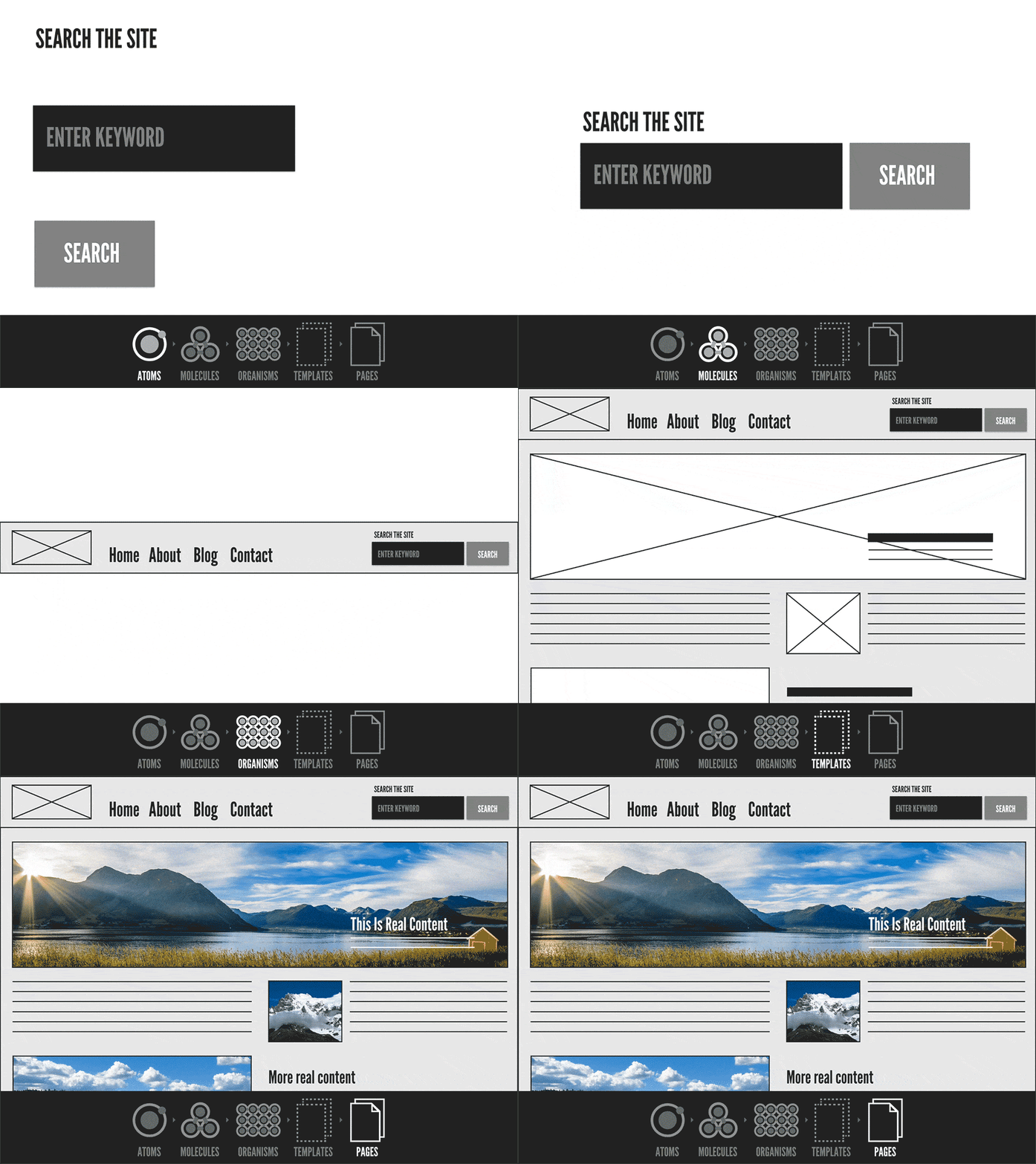
The shift from designing and building full screens to reusable components has begun, and it’s not just for small startups looking to be nimble and quick. Enterprise applications, often considered to be large and slow moving, should take note of these modular concepts to embrace cost savings, ease of maintenance, and speed of development.
Modular design components help break a product down to its base level to create a cohesive product for a user. This architecture reduces duplication of development efforts and eases the burden on QA. Increasing maintainability and performance of the product and its lifecycle are additional benefits stemming from this philosophy.
Modular design components help break a product down to it’s base level to create a cohesive product for a user.
Designing an application’s atomic pieces; buttons, form elements, typography, color palette, help bring unity and brand cohesion to an application. By reinforcing and duplicating these interface patterns, users gain a sense of trust and comfort, allowing them to flow through an application with less interruption and finish their more easily. When combined, these atomic pieces create visual elements that can be paired together to create task-specific layouts. It reduces design feedback cycles, gives power to the front end designers to build new features quicker by reducing duplication of work and allows businesses to test with real users sooner.

Developers should rejoice in this modular based future. Building a component that has a flexible width and can be used anywhere in the application means less code to maintain. This helps enforce a DRY (Don’t Repeat Yourself) mentality, and reduces one off screens with unmaintainable styles. CSS classes are favored over IDs, HTML selectors, or deep nesting classes; to keep specificity equal among the styles. Writing semantic accessible code in your modules helps move your product to one that is inclusive to all users.
Enterprise applications will have numerous developers work in the codebase over its lifetime. Developers join and leave the team and/or the company, contractors and consultants are brought in for specific features, and new features and updates are done as the application evolves and pivots. Using a modular system allows for the use of a CSS methodology – a strict naming and styling convention – to ensure that various developers write with a single syntax. Methodologies such as Object Oriented CSS, Scalable and Modular Architecture CSS, and Block Element Modifier are all great starting points. Primary benefits from a methodology include smaller CSS files, better maintainability, and lower barrier of entry when onboarding new team members.
Writing semantic accessible code in your modules helps move your product to one that is inclusive to all users.
QA time is reduced with component-based architecture. Instead of being presented with new styles for each ticket, QA can begin to test components as they’re built – testing across a myriad of devices and systems. Putting components through rigorous testing on their first pass, for accessibility, browser support, device support and progressive enhancement; ensures these components are working proper and can be reused with ease. On their next encounter, QA can be confident that the component is in working order and reduce the amount of QA tests they’ll need to perform, and can further decrease that time with the help of test automation.
Applications that build new features based on full screens are expensive to maintain. Design inconsistencies are often introduced in static design mockups; due to old design mockups being reused, current screens being recreated or designers focusing on small pixel increment edits. Moving to a modular system, designers can reference the component directly in the pattern library knowing that it’s the current version. If the designer is so skilled, they can even edit the module in the library and use automated UI tests to validate the updates don’t break the component in the application.
This style of modular composition results in a smaller stylesheet. This is less bandwidth for your server to handle which results in lower bandwidth costs. Shrinking your stylesheet is one step to helping decrease the load time of your application for users, which is helpful because a 1 second delay in loading can result in a 7% decrease of conversions. If there is less code to maintain, making development a bit easier, the company will save developers time which translates to saving company money.
Moving to a modular system, designers can reference the component directly in the pattern library knowing that it’s the current version.
Writing in modular fashion isn’t just for small startups. Large enterprise companies, and their customers, can benefit from this type of architecture. By reducing process complexity companies can create products that can reach market quicker, reduce development time, save money in several areas, build responsive and accessible products that can reach larger audiences and use industry best practices to stay current with modern processes.
At Cantina, we’ve worked with a wide range of companies and implemented solutions that scale to support millions of users implementing this style of architecture. We’ve personally witnessed the benefits it introduces – reduced QA time, lower overall project cost, decreased development complexity, simplified team management, better maintainability, and less design time on future enhancements. These benefits - along with accessibility compliance and progressive enhancement - make this process a veritable no-brainer for organizations to adopt. At Cantina we use this architecture in all of our Client projects. If you have a project that needs our expertise, we’d love to hear from you.


