In the real world, space is a given. We create spaces just for specific tasks—a kitchen for cooking, a dining room for dinner, a bedroom for sleep. These spaces shift our modes of thought. We go to the store to shop and the beach to relax. When we want to work, we go to the office—well, used to.
The liminal spaces between these environments are important - crucial even. Passing through a door to another room literally resets your brain. It’s why you find yourself saying “what did I come in here for?” These threshold spaces blur the edges between dissimilar spaces, but also help to transition us between them.
But in today’s modern tech environment, we as designers sometimes don’t give our users space to move between tasks. Designers fixate on seamless experiences. We design in ways to remove all delays between steps in a process and find ways to design transitions between tasks so that they only take nanoseconds. However, liminal spaces in information architecture—thresholds, or seams in the experience—are important to help users follow transitions to new actions of the digital workflow. Designers who neglect liminal spaces risk creating confusing experiences by sacrificing context for speed.
Common Types of Conceptual Seams
In order to effectively design these seams between conceptual models1, designers must understand both the reasons for seams and the types of seams.

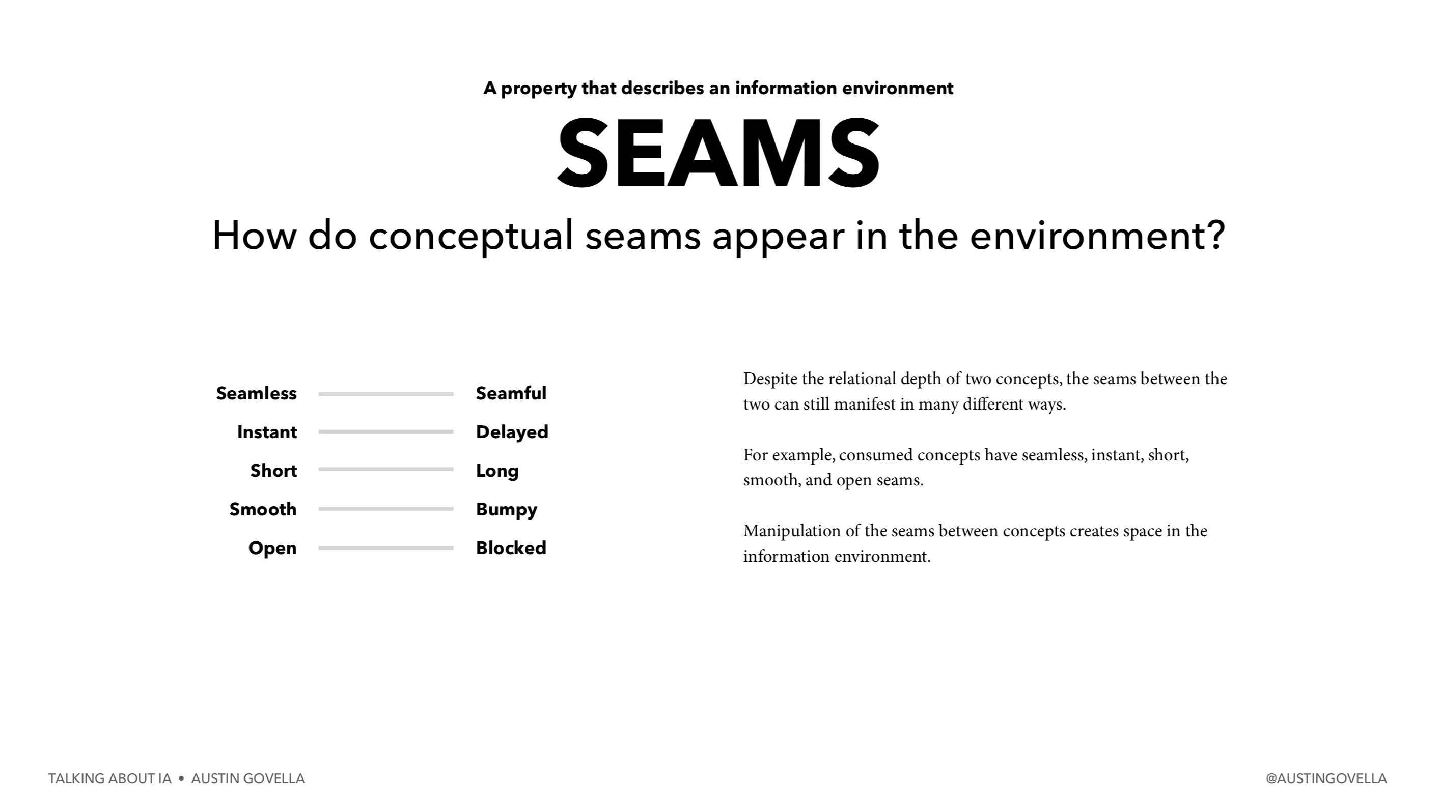
As Austin Govella said in his IA Conference 2020 talk, manipulating seams between concepts creates space for users in the information environment. This can mean creating delays, blocking progress, “breaking the plane” of the information environment, or other similar techniques for highlighting the liminal space created between two conceptual models.
Modals
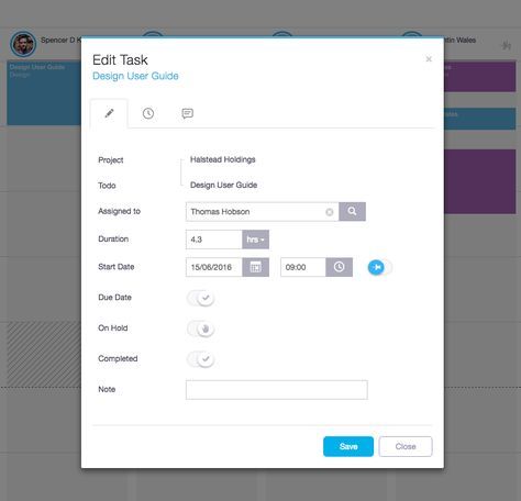
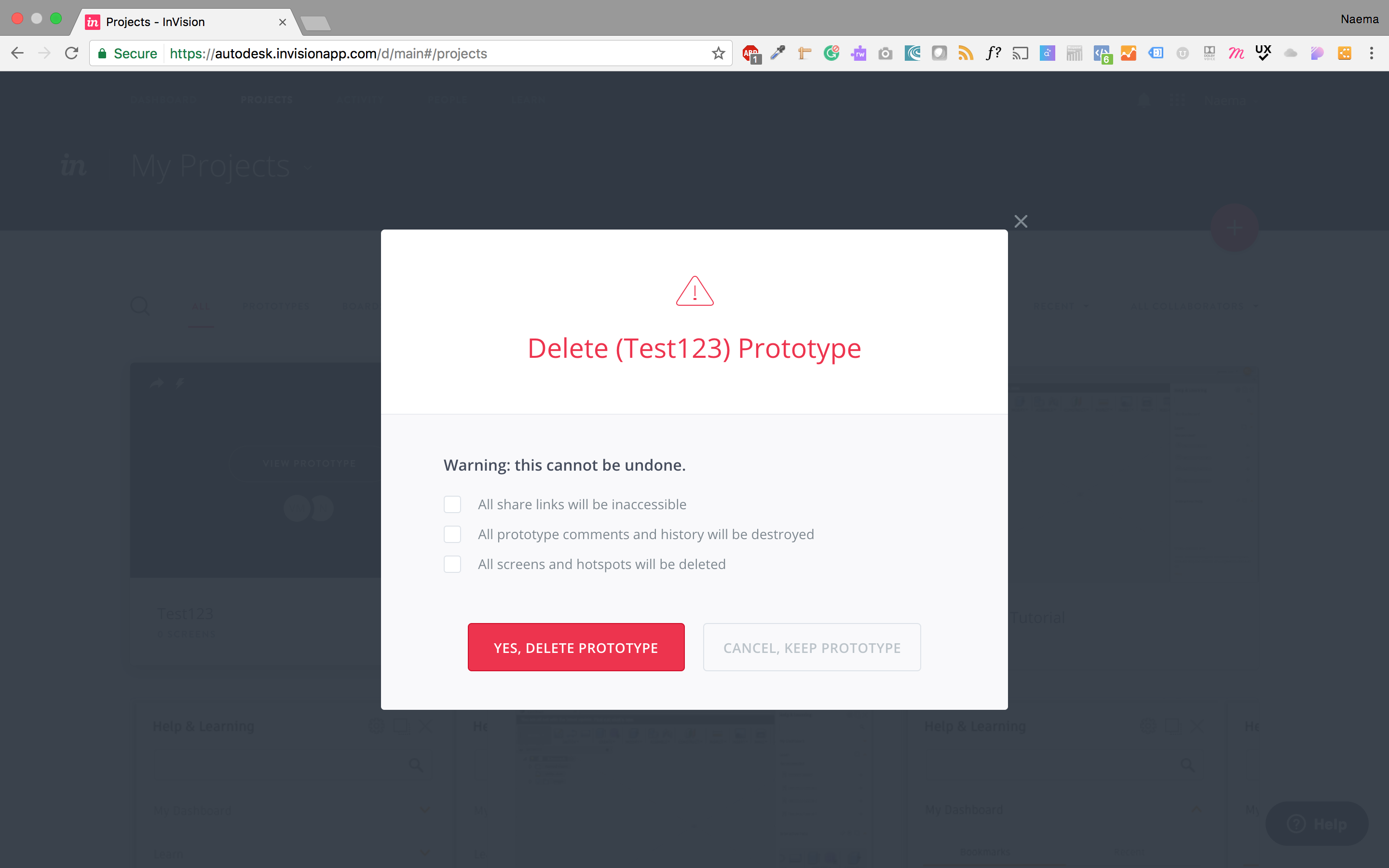
One way to effectively break the plane of an information environment is a modal. These are a heavy-handed method for indicating a task separate from the current path a user is on. Save these for seams where clear context back to the original task is desired and where the task being presented is entirely self-contained.

Reconsider using modals purely for decision points in an information architecture. Invision uses a modal for deletion. This task that could be handled inline, but the Invision team uses a modal here because of its disruptive nature. (See image below.)

Steppers and Progress Indicators
Steppers and progress indicators are best used for combining related concepts but still show clear transitions between each phase. It’s best to avoid trying to represent all states simultaneously. Rather, provide a clear method for transitioning between states and clearly show the differences between them. Consider view modeling instead of a stepped approach if the process is nonlinear.

View Modeling
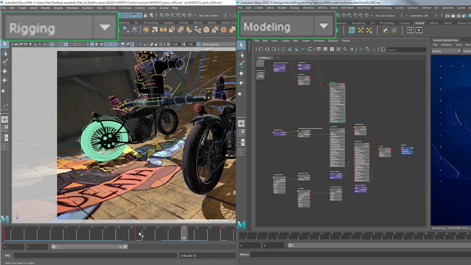
This is most often seen in creative software, especially 3D software. This approach doesn’t attempt to predict which mental model needs to be used (modeling, rendering, or animation, for example). Instead, it gives manual control. Be careful when using this approach, as what’s changed in the interface may not be entirely clear.

Ultimately, view modeling is about providing nonlinear controls to move between different mental models. Action bars (horizontal or vertical icon navigation) or tabbed interfaces are two other ways to handle view modeling.
Transitory Screens & Animations
Not all seams require interaction. Sometimes, a simple, “we were doing X, now we’re going to do Y” will suffice. Animation is particularly helpful here to indicate state transition. While forcing someone to pay attention is impossible, delays in the interface can still highlight changes.

Liminal Spaces in Use
These transitory spaces are particularly critical in enterprise software—the type that people use in their 9-to-5 jobs and often depend on. Consider the case of a travel sheet in animal health. These are one-page paper forms that “travel” with the patient, from the front desk, to the exam room, to the treatment area, and back to the front desk. The changing physical location of the sheet forces users to transition between shifting mental models—examination, treatment, and post-visit care.

Now take that same travel sheet and translate it into a digital environment. To create a fluid experience, a designer may attempt to represent all states simultaneously. This muddles the mental models, the actors, and the critical information being displayed. The entire interaction has become ambiguous and liminal because of a lack of seams in the information architecture. Experiences designed in this way violate Nielsen’s No. 2 usability heuristic - keeping a match between the system and the real world.
Information that’s critical in certain stages of the process—such as pet owner details at the first and last stages—is mostly secondary in the middle two stages. While all four stages are part of the holistic mental model for the visit, at each stage the mental model, players, and user needs ebb and flow. Liminal spaces in the information architecture would help properly translate the physical world steps of a visit into the digital experience.

In practical application, this is why designers use modals, transitory screens, or steppers and progress indicators to deliberately indicate a shift in mental models. A good example is Turbotax, an experience deliberately built with seams in mind. The application handles a task with multiple shifting contexts—federal, state, and local. It also must handle constantly moving between topics such as “how much did you make?” or, “did you own a home this year?” and carefully transition people between these states using friendly copy and a clear hierarchy.
Using tabs (as a form of view modeling), steppers, and robust interaction options will maintain context while transitioning between states, as shown in the wireframe below. While the user is focused on the “subjective” step of the exam, they can choose to move laterally through the examination steps or vertically between different states of the clinic visit. User testing could determine if this way of helping a user maintain simultaneous context is enough or if additional transitory screen(s) need to be added. A summary should also be presented at the end. It’s important to note that liminal spaces should aid in transitioning between states—not slow down power users from quickly and intuitively moving through their workflow.

Tips for designing information architecture seams.
To recap, here are a few techniques for navigating seams in your information environment:
- Understand the various modes and mental models represented in your experience.
- Identify tasks that are self-contained and ancillary to the main job-to-be-done. Contrast these with individual tasks or interactions that collectively make up the primary experience.
- Highlight the transitions between these shifting modes and determine the best method for indicating the transition.
- Look for gaps between your conceptual model and user’s mental model, and determine the best method for dealing with the gap.
This last point, while not directly addressed here, is key. There’s a difference between a user moving to a different task (and a different mental model), and a gap that’s created because your conceptual model doesn’t match their mental model.
Summary
While neat and clear-cut flowcharts exist for making user flow decisions, a shared language can help move information architecture closer to a framework for designing seams between concepts. Aspects of an information architecture such as various mental models, whether or not a task is self-contained, and its relationship to other tasks within the broader IA can help designers make consistent determinations in presenting concepts.
Further reading:
- Modal vs Page: A Decision Making Framework | by Ryan Neufeld
- Modes in User Interfaces: When They Help and When They Hurt Users
- How information architecture changes at different scales
- Modality Is the One UX Concept That Most Designers Don’t Fully Understand
- Five Models for Making Sense of Complex Systems
-
Conceptual models and mental models are used somewhat interchangeably here. However, it’s important to note that mental models are internal to the user, while conceptual models are how the system reflects the user’s mental model. ↩


