linkedin tracking
icon-sprite Created with Sketch.
Skip to main content
OAG Analyser

Intelligent Travel Platform

OAG partnered with Cantina to enhance their Analyser experience through the application of UX best practices, modern interactions, and visual design patterns.

imnage of a jet

Overview

If you've ever flown, OAG Analyser has likely impacted your air travel. OAG Analyser provides air traffic data and intelligence to the travel industry. Its mission is to help organizations — from airlines to government agencies — make better decisions using data for flight planning, analysis and performance.

Already a leader in the travel industry, OAG was at a pivotal moment of platform growth and feature diversification. But to expand into new markets, it needed a fresh user experience and an improved design system to position the company towards a bigger future.

Cantina was tasked with redesigning the Analyser user interface based on an understanding of what users needed from the tool, starting with a hypothesis about what might work best. Then iterating on a prototyping and user testing cycle to validate the design while making progress against measurable goals. A key challenge was to balance the product's technical audience with a modern design that would attract new customers. And we needed to do this in just a couple of weeks.

New Design

A Bold Strategy on an Outdated Experience

OAG is all about providing data and insight to their customers, who happen to be the world’s flight industry, from airlines and airports to government agencies. OAG data powers everything from departures and arrivals boards to operations such as route planning and equipment schedules. Being able to dive into data and having the tools to turn it into insight and action is vital to the modern airline industry.

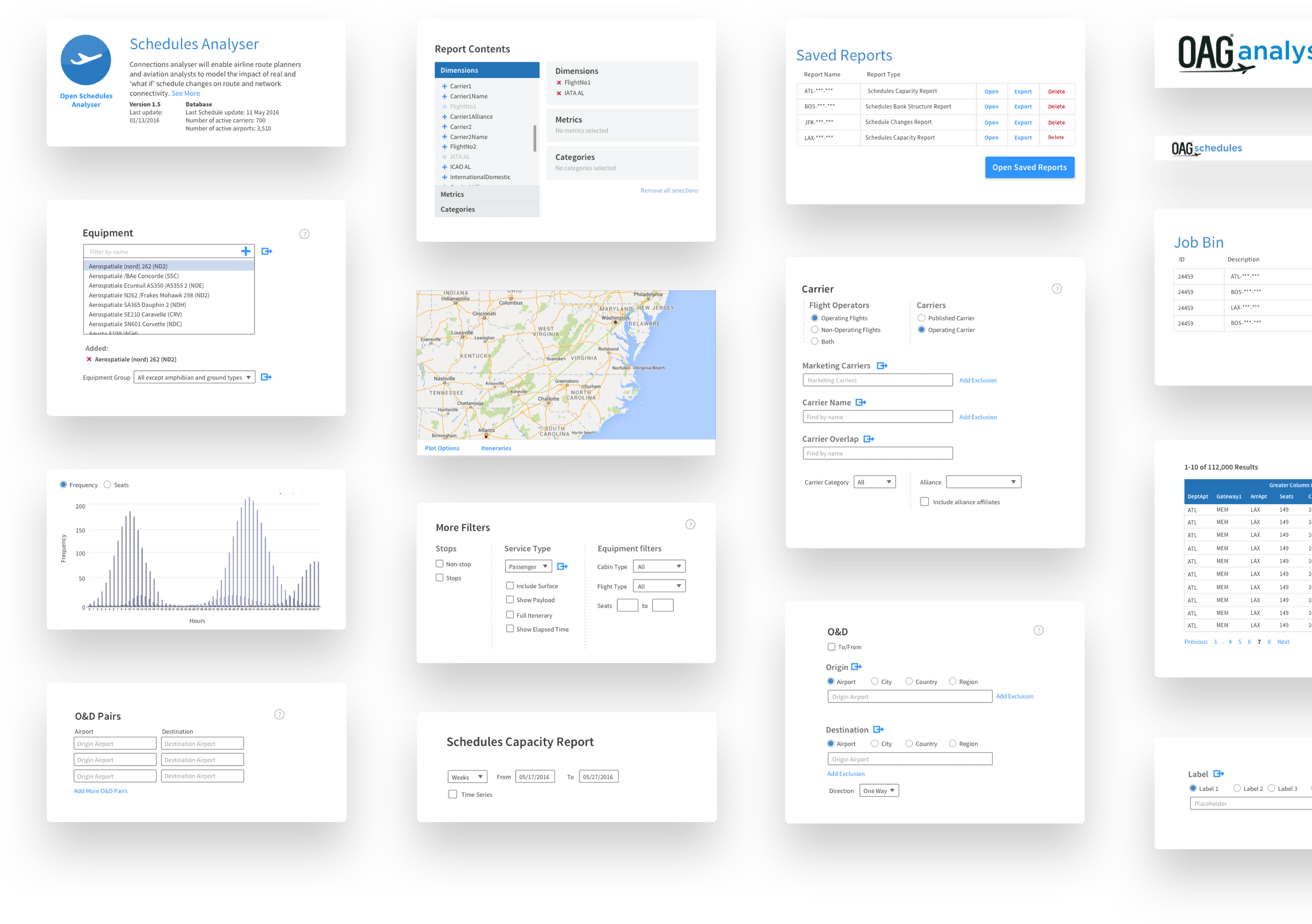
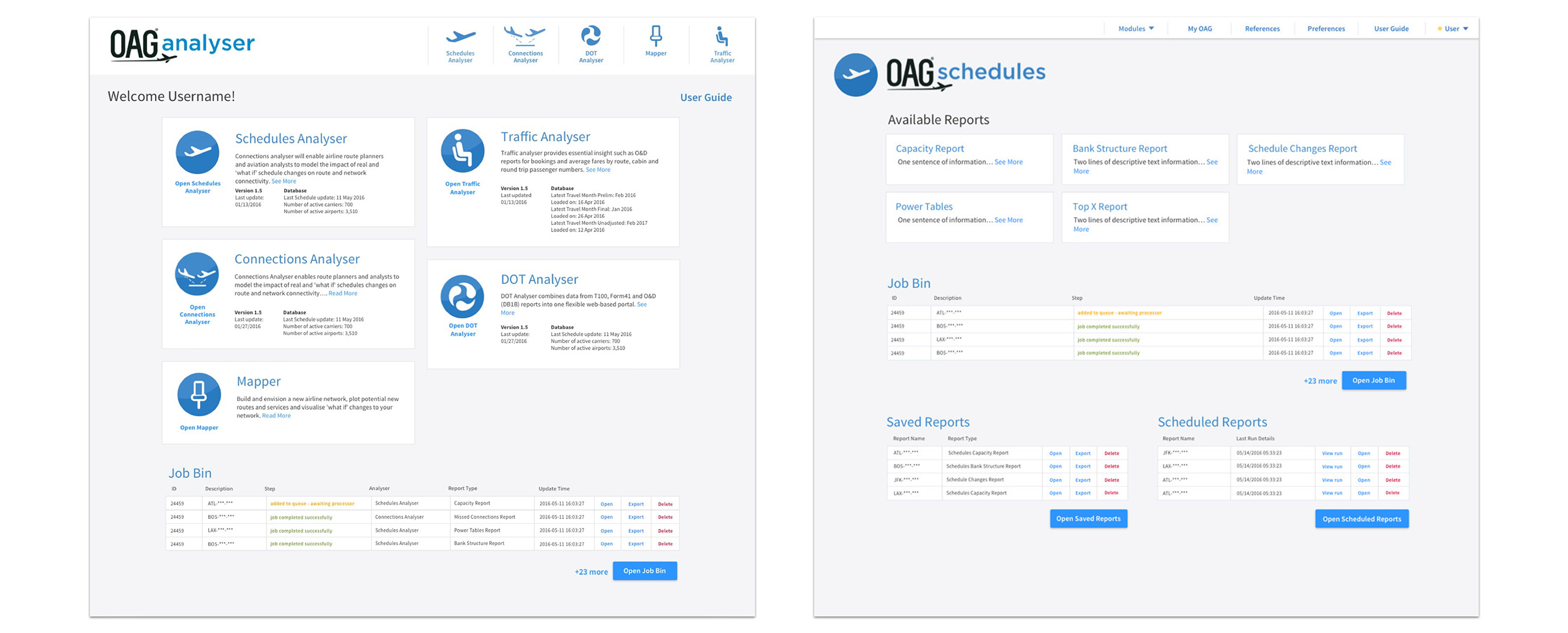
OAG Analyzer is an advanced tool for querying airline data. It incorporates hundreds of data points and a vast number of records, allowing airlines to see what is and plan what will be. When OAG engaged Cantina, the user interface was outdated. The query interfaces were complex and hard to navigate for new users, and did not focus on the main elements for experienced users. At the same time, many long-time users of the existing tools had built up a lot of muscle memory with this convoluted user interface, so any changes or disruptions in the design needed to not break their valuable workflows.

OAG partnered with us to identify problems with the existing design and opportunities for gains in performance and user efficiency, placing a greater emphasis on data presentation and simplifying the interface's key features.

We broke down the project into four design elements that would support OAG’s goals for Analyser:

  1. Create a pattern library that gives OAG the ability to update current and future modules to suit user needs
  2. Add front-end appeal to a tech-heavy interface using a simplified data presentation to create a strong, engaging customer experience
  3. Support several types of users from beginners who just need a quick report to advance users who gather a multitude of intelligence for their businesses
  4. Better onboarding for new users and the ability to preview reports to understand what details they would include
New design system
New design system.

Human-centered Approach

Thinking Like a UX Designer

OAG did not have much experience in UX design. Their tools were effective and functional, but not the easiest to adopt or get the most value out of for less technical users. To help them overcome this, and get them thinking like UX designers, we kicked out the project by building a set of hypotheses to guide our design decisions. Using research techniques, including customer interviews and observation of user behavior, we were able to map the customer journey and identify mission-critical elements of the existing UI. This gave us a theory of how to prioritize UI features and functions in the new design.

We also uncovered an issue with how OAG evolved the existing features and UI of Analyser. When new feature requests came in from customers, the habit was to add a new field to one of Analyser’s existing query modules, without considering how this would affect the holistic experience. New users often missed the changes to the form, and existing users often had to be briefed individually about the new feature. To alleviate this, we implemented a design system for Analyser, and worked with the product and development teams to create a process for thinking about new features, and we created space in the new design to allow for updates that would not disrupt the whole.

New homepage and scheduler designs
New homepage and scheduler designs.

Future Thinking

Reusable Pattern Library and Styleguide

Our design process focused primarily on prototyping and delivering a pattern library that could accommodate a diverse set of needs across a spectrum of users and requests.

We allowed our core design principles to guide the process, formulating a reimagined module that brought relevant information together, presented users with more informed choices and allowed future users to jump into the Analyser without a steep learning curve.

We worked side by side with the OAG team, which allowed us to prototype, sometimes creating multiple iterations in one day rapidly. We also re-interviewed some users to show them updates and additions we had developed based on their feedback to ensure the design direction was on track. Prototyping is much easier when you form a great partnership, and we did just that with OAG.

•••

If you are interested in learning more about this engagement or how Cantina can help you with a project contact us today. We'd love to help.

View more work