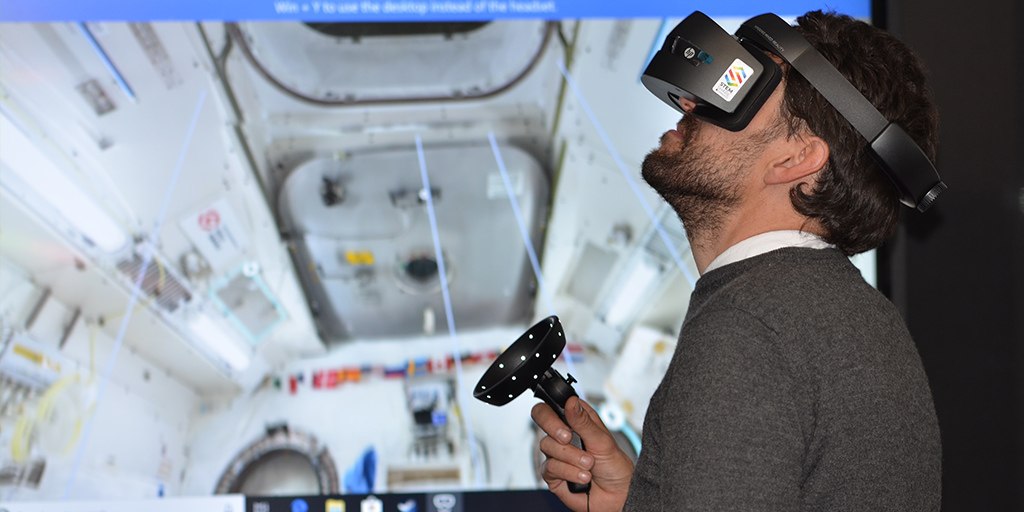
By 2024 the virtual reality market is expected to surpass USD 44.7 billion, over six times the current market value of USD 7.9 billion.* To put this into perspective, the US box office grossed a total of 41.7 billion in 2018. The reach of VR will surpass gaming, potentially transforming fields such as medicine, psychology, entertainment, education and sports. Imagine a doctor being able to perform remote surgery in VR. Or, being able to be “live” on the field of a beloved sporting event from the comfort of your home.
As the evolution of the digital landscape accelerates and broadens, so do expectations of the experience designer. To remain relevant, designers will need to design for 3D, incorporating not just visual depth, but also sound, touch and even emotional design. Designers need to find ways to adapt their existing knowledge and expand their abilities to design for these emerging mediums. To help designers make the leap into the magical world of VR, this article will anchor the transition from 2D to 3D in a UX stronghold—Nielsen’s 10 Heuristics, one heuristic at a time.
1. Visibility of system status.
The system should always keep users informed about what is going on through appropriate feedback within a reasonable time.
The completely immersive, three-dimensional nature of virtual reality allows users a 360° viewport, and depending on the experience, complete physical mobility. The extended visual and physical access enjoyed by the user results in an increased responsibility of the designer to ensure an omni-present system status. Fortunately, virtual reality also provides its creators with a large arsenal of tools to help keep their users informed. Binaural, visual and haptic feedback are all available to help indicate successful engagement. Thoughtful approaches to audio-engineering to help indicate distance and a methodical revealing of visual information can further enhance a user’s grasp of system status.
For example, The Void, a multiplayer VR experience, provides its audience with an entire room in which to become Star Wars Stormtroopers on a dangerous mission. In this example, players need system status in a traditional sense (progress on the mission, or haptic and sound blaster-feedback), but also status on their fellow-players as they each move independently throughout the space.
2. Match between system and the real world.
The system should speak the user’s language, with words, phrases and concepts familiar to the user, rather than system-oriented terms. Follow real-world conventions, making information appear in a natural and logical order.
Virtual Reality possesses the privilege of delighting its users with worlds previously inaccessible. Imagine letting a room of 5th graders better understand their place in the universe by independently exploring the solar system in 3D! To help users acclimate to the previously unexplored, the designer can build an incremental understanding of the virtual world on existing knowledge of the real one. For example, a virtual universe application could teach children about zero gravity by “starting on earth” and slowly reducing the “gravity” in the virtual universe. Through the acclimation process, per Nielsen’s heuristic, the designer should use the user’s vernacular, and ensure that new information is presented logically.
As a user becomes more acclimated, designers can take care to gradually build familiarity with the unfamiliar environments and experiences. For example, Facebook, creator of the popular Oculus Quest, is currently experimenting with incorporating real-world, predictable objects and interactions such as skinned avatars and holographic hands into their VR experiences.
3. User control and freedom.
Users often choose system functions by mistake and will need a clearly marked “emergency exit” to leave the unwanted state without having to go through an extended dialogue. Support undo and redo.
Honesty and safety become essential components to ensuring user control and freedom in the world of VR. The experience designer should consider such factors as the weight of the headset and the intended medium of interactivity. Important questions to consider include: How long will the user be wearing the headset? Will the weight of the headset become uncomfortable or harmful during this time? Will the user be sitting or standing, and will they want to move during the experience? If so, as with The Void, does the user need an entire room to interact safely with the experience? How might the designer ensure the physical safety of a participant who has had many of their senses blocked?
Another well-documented safety concern for users during VR interactivity is nausea and vomiting. This is most often caused by the discordance between visually-perceived motion in the VR experience and the stationary body. However, nausea can also be caused by sudden changes in brightness, vivid patterns within the application or when exiting the application. Designers can mitigate these problems by moderating brightness, avoiding sudden accelerations, maintaining head tracking and using teleportation to move the users within the experience.
Most importantly, the user may also experience a body-ownership-illusion over their virtual selves, causing them to physically experience the pain of their avatars. Imagine fighting the White Walkers from the north as a virtual Jon Snow is filleted by a sword. For some, this virtual pain could become a physical one. Due to these safety concerns, it becomes imperative that the user always feel in control of their experience. Therefore, the designer should provide frequent and mindful “emergency” exits for the user.
Finally, as always, allowances should be made to encourage inclusivity and accessibility to persons with disabilities.
4. Consistency and standards.
Users should not have to wonder whether different words, situations, or actions mean the same thing. Follow platform conventions
As the VR designer immerses the user into their new surroundings, they should ensure consistency of the virtual experience by respecting platform conventions from physical experiences. Imagine a real-estate agent giving a virtual reality house tour and having the prospective buyer turn to the “door” to leave the room only to find the teleportation controls behind them on the window. To ensure a consistent and predictable experience, audio, visual and spatial cues should be kept consistent and predictable. Along with real-world conventions, the designer should maintain consistent horizon lines, brightness levels and perspective. Finally, the designer should be mindful to create experiences that mirror natural human motion. For example, where arm motion is required, the designer should design for arcs instead of straight lines. Facebook, for example, has been experimenting with using life-size, circular menus to maximize the natural motion of the human arm.
5. Error prevention.
Even better than good error messages is a careful design which prevents a problem from occurring in the first place. Either eliminate error-prone conditions or check for them and present users with a confirmation option before they commit to the action.
As with the 3rd heuristic, User Control and Freedom, the concept of error prevention can be expanded to include the user’s mental and physical safety. The potential for a painful body-ownership illusion makes it imperative for the designer to ensure that the user feels encouraged to experience the mysticism of the medium fully, but not to do things that would make them feel unsafe or be in pain in reality. Additionally, the creator can allow for “safe poses” or ways in which the user can temporarily, and mindfully, disconnect from the virtual experience. In the Game Of Thrones example above, a “safe pose,” allowing the user to temporarily pause from the White Walker battle could be the difference between a terrible and pleasurable VR experience.
Similarly, designers can minimize nausea by utilizing teleportation for movement, and avoiding stark changes in brightness, unexpected accelerations and high-spatial patterns. Furthermore, it is important to maintain the user’s sense of autonomy by giving them control over the camera and maintaining headtracking. UX and UI should be developed such that interactive elements are always visually accessible to the user. Binaural audio and graphics with thoughtful indications of visual depth can help create dimensionality and help the user stay grounded in their new medium.
Finally, where the user’s physical and mental safety can be threatened, the designer should be diligent in designing for universal accessibility. Designers should ensure that their instructions are clear and illustrated both visually and audibly.
6. Recognition rather than recall.
Minimize the user’s memory load by making objects, actions, and options visible. The user should not have to remember information from one part of the dialogue to another. Instructions for use of the system should be visible or easily retrievable whenever appropriate.
Prioritizing recognition over recall remains important in the transition from 2D to 3D. Designers should build on the user’s knowledge of the real world and ensure that important information and interactions stay consistent throughout the experience. In addition to ensuring consistency, a designer can help users mindfully re-enter the experience by providing cues as to where the user previously exited. For example, for a child re-entering the solar system, a designer could design a “recap” flow, not only reinforcing previous learning, but reminding the child of their current location in the virtual “universe” as well. Alternatively, for a surgeon performing a procedure in VR, the application could display the steps already completed, helping not only to keep the current surgeon present and accountable, but minimizing risk if a transfer of care between surgeons was needed.
7. Flexibility and efficiency of use.
Accelerators — unseen by the novice user — may often speed up the interaction for the expert user such that the system can cater to both inexperienced and experienced users. Allow users to tailor frequent actions.
Flexibility and efficiency remain an essential heuristic for Virtual Reality. Where the designer has a much larger arsenal of interactivity tools (such as gaze, speech, physical mobility), accelerators should be applied to those as well. For instance, designers could allow power users to navigate menus with a “long gaze” interaction once the more-traditional “point and shoot” interaction has been mastered. Imagine being able to experience a sporting event in VR from the comfort of your home with an application that knows to zoom in on a player based on the your visual focus! As the user adapts to a new environment, a meticulous, incremental approach to introducing and tailoring actions can help the user acclimate and feel empowered within the medium.
8. Aesthetic and minimalist design.
Dialogues should not contain information which is irrelevant or rarely needed. Every extra unit of information in a dialogue competes with the relevant units of information and diminishes their relative visibility.
The right balance of the fantastic and realism in a virtual reality experience can delight the user, allowing for physical abilities unavailable in reality. For example, VR could present a medical future where surgeons operate remotely with digital accuracy not possible with the human eye. Designers can help find the ideal blend of mysticism and reality by taking advantage of the medium to maintain aesthetic and minimalist designs. When appropriate, designers should occlude unnecessary information and ensure the ability to turn on and off UI elements. This allows designers to help guide the user through the intended path by presenting informational elements only when they’re in the user’s direct field of view. VR specific UI elements such as “pull” down widgets and teleportation can further enhance and optimize the experience.
9. Help users recognize, diagnose, and recover from errors.
Error messages** should be expressed in plain language (no codes), precisely indicate the problem, and constructively suggest a solution.
As discussed, VR can affect their user’s sense of personal safety. As a result, error prevention becomes tantamount to error correction. As mentioned previously, VR designers should help their users avoid errors by building an incremental learning of the new world from existing knowledge of the real one. Due to potentially serious consequences, permanent decisions should always be designed with extra preventative measures such as warnings, added steps and feedback. Where possible, designers should include an “undo” option.
10. Help and documentation.
Even though it is better if the system can be used without documentation, it may be necessary to provide help and documentation. Any such information should be easy to search, focused on the user’s task, list concrete steps to be carried out, and not be too large.
Nielsen’s Help and Documentation heuristic translates well to the design of experiences for Virtual Reality. Where possible, the designer should use visual, binaural, and haptic cues to help the user learn the new interactions of their space. Additional necessary information can be included in help and documentation. Carefully explaining and documenting novel, VR-specific interactions such as a “long gaze,” for selection or a “point-and-hover” for tooltip, can maximize both productivity and pleasure. Finally, per the original instruction, documentation should be “easy to search, focused on the user’s task, list concrete steps to be carried out, and not be too large.”
Summary
VR isn’t new, but its exploding rate of adoption, advancing technological capabilities and growing access to cheap and good hardware signals a need for a mature VR design practice. By anchoring and adapting their designs in best practices, Experience Designers can ensure that they are able to translate their skills to produce awe-inspiring and human-centered virtual reality experiences for all.
* according to report by MarketsAndMarkets
Sources
- 10 Usability Heuristics for User Interface Design // Jakob Nielsen
- Incorporating UX in Virtual Reality // Shachar Shamir
- The User Experience of Virtual Reality // Nick Dauchot
- How Facebook Designs for VR Environments // Anne Lee
- Designing for Virtual Reality: 3 Tips for Content Strategists // Andrea Zeller
- A Month Designing in VR // Julius Tarng
- UX + VR: 14 Guidelines for Creating Great First Experiences // Staci Jaime
- Designing for Google Cardboard // Google
- An Experience Framework for Virtual Reality // Punchcut in Punchcut
- Design Insights for Virtual Reality UX // Punchcut in Punchcut


