Our three 2020 Apple Worldwide Developers Conference (WWDC) attendees, Justin, Janus and Dakota, gleaned many useful ideas and highlights from the experience that they’d like to share. So, here they are:

Overall Thoughts on Format
Every year, Apple’s Worldwide Developers Conference (WWDC) makes sessions available online. But this was the first year that there was not also an in-person component. With no sessions taking place in front of a live audience, the sessions were able to be more concise. Previously, most WWDC talks were 45-60 minutes. This year, there were many talks in the 15-20 minute range. These new talks were still very effective, delivering as much or more information in a shorter time frame. It also opened the opportunity for Apple to try different formats, such as the Widgets code-along - WWDC20 - Apple Developer session, which is a three-part talk series that walks you, step by step, through creating a Widget with Swift UI. For the first time ever, Labs were also put online and made available to anyone with a paid developer account. Labs are an invaluable opportunity to speak directly with the Apple engineers about issues you are having. I personally did not attend the labs. But, from what I have seen in the online community, the online-only format was just as helpful and much more accessible than it would have been in person. No ticket, flights or hotel required, just a paid Apple developer account. If WWDC goes back to having an in-person component next year, I hope Apple considers keeping some of the new session formats and lab formats moving forward.
Advances in UICollectionView
This year at WWDC, Apple introduced List with UICollectionViews. They added a List configuration to UICollectionViewCompositionalLayout. This list configuration gives you the same functionality that you get with UITableView, but with the added flexibility of a UICollectionView with a compositional layout. This List configuration will give you the gesture behaviors expected from UITableView, such as swipe, re-order, edit, etc. This configuration also adds List specific styles such as Plain and Grouped that mimic their UITableView counterpart, as well as the default cell types you would expect to see. It also adds the Sidebar and Sidebar plain styles that are exclusive to Lists with UICollectionView.
UITableView can mix different style cells, but can only facilitate one layout style per table. Lists with UICollectionView, on the other hand, can facilitate multiple layout styles in a single list, one per section. For example, Apple demoed an app whose first section was a collection of Views that scrolled horizontally. The next section was a standard vertical scrolling List that looked and acted like a UITableView with gesture interactions per cell. All of this was done with one UICollectionView. You can try Demo App via the link.
Apple is encouraging developers to update their current UITableView implementations to use UICollectionView where possible to take advantage of the added flexibility. Reading the tea leaves of these sessions, I believe Apple is signaling that UITableView will be deprecated in the next couple of years. Overall, this is a welcome change. UICollectionView compositional layout API is an improvement over UITableView, and there appears to be no downside to switching your implementation. However, since UITableView is such a foundation of iOS and iPadOS design, this will be a big change for many developers in the coming years.
Recommended WWDC Videos
UICollectionView
Diffable data sources
SwiftUI

Introducing App Clips
One of the most exciting announcements from this year's WWDC was the introduction of "App Clips". App clips represent a novel approach to app discovery and acquisition - similar to Android's Instant Apps. Instead of being discovered through the Apple Store, app clips are discovered through URLs passed from QR codes, NFC tags, maps, nearby suggestions, messages, and Safari links. The URL is then associated with your app clip via App Store Connect and a pop-up card appears at the bottom of the screen. The pop-up card is analogous to a regular app's Apple Store listing. It offers the user some basic info, possibly an image, and the opportunity to load and run the app clip immediately. App clips are limited to 10 MB (megabytes) . So they are designed to install quickly. The user can then use the app clip as if it were a regularly installed app. Afterwards, the app clip binary is considered temporary by the system and will be deleted if not soon reused. This makes them, from a user's perspective, disposable apps. The benefit to the user is that a single-use app will install quickly and then go away. It won't permanently clutter up the user's phone.
How App Clips Work
nder the hood, each app clip is a stand alone binary representing a subset of a larger parent app. Every app clip requires a parent app. You can't create independent app clips. You create the app clip in Xcode by selecting out portions of your parent app and then submitting it all for review together. For best practices, Apple recommends that each app clip represent a single function from the parent app. They don't recommend using a lot of complex navigation or menus. So, for instance, Apple suggested a use case in which a restaurant may offer one app clip for ordering food and a different app clip for reserving a table - even if the parent app does both.
App clips also come with a few limitations. For instance, app clips do not have access to persistent memory. So one should consider the app clip's data as a temporary cache. However, there are ways to transfer the app clip's temporary data to the parent app - assuming the parent app is installed on the device. And, as mentioned above, app clips are limited to 10 MB. So you can't get too fancy with video or graphics assets.
On the plus side, to ease friction, app clips are able to use Apple Pay and Sign in with Apple. App clips are also able to receive notifications (with some time-based limitations). So, for instance, a restaurant reservation app clip might notify the user when their table is ready.
Apple recommends offering the user a chance to install the full parent app after the app clip has completed its function. Once installed, future app clip invocations will open the parent app instead of the app clip. This means you'll want to keep the two experiences in sync to avoid confusing users who are familiar with the app clip, but not the parent app.
Recommended WWDC Videos
Burying The Lede
App clips offer more than just a streamlined discovery experience. One of the technical sessions (Create app clips for other businesses) suggested an entirely novel business model for selling mobile applications. They didn't mention this in any of the other sessions. So it almost felt like they were burying the lede. They suggested a company might build a template parent app and then use it as a base to host app clips for multiple client businesses. Using multiple URLs, one could configure the template app to present uniquely configured app clips for each client. This could be a big deal going forward. Watch this space!
Recommended WWDC Videos
Update
Since writing that last paragraph, I’ve found another Apple video which mentions this new business model.

General Thoughts
Before diving into the technology, Tim Cook began with a very human and important moment. With millions of eyes watching, Tim started WWDC 2020 by acknowledging the need for active change to combat the systemic racism towards black and brown people.
“We must all aim far higher to build a future that lives up to our ideals; this means taking action.” - Tim Cook
Tim also talked about the COVID-19 pandemic that has been affecting billions of people’s lives, and extends his appreciation on behalf of Apple to all essential workers who are sacrificing so much to help others during this pandemic.
I loved the keynote. I’ve been watching these for a long time, and I think Apple was able to spin this year’s unexpected format change into a huge positive. WWDC has never been more accessible than it was this year. I left the keynote feeling the same inspiration I felt during the days of MacWorld.
Privacy
App Store Privacy Labels - Apps will have details regarding data collection practices on their app store listings as part of a new privacy disclosure policy.
Privacy has been a guiding principle for Apple’s product development for a long time. Privacy is a fundamental human right. And Apple is very proud, and rightfully so, of their efforts to empower users to make educated choices about how they use their data, protect what’s important to users, as well as protect them from sophisticated automatic tracking. As part of this effort, Apple is introducing privacy labels. Currently, when a user navigates to a new app in the App Store, there is no information in the app details about what data can be collected by the app. Upon downloading, users are met with wordy privacy policies, terms and conditions, and permission requests that are far too easy to just hurtle past. These labels aim to inform users about what data will be linked to their account and what data can be used to track them across other apps/websites, such as payment details, location, and/or device fingerprints such as Locale configuration. This is probably one of the things I’m most excited about from WWDC.
Visual indicators for sensor access - With iOS 14, there will be a visual indicator if an app is accessing the user’s camera or microphone.
Users can’t control what they don’t know about.
Users can’t control what they don’t know about. How often do people just grant whatever permission is requested to get past the gate and engage with the app? Too often. If an application accesses the mic/camera while you’re talking with someone about something personal, this indicator may help people reevaluate those permissions. I’m interested in the UX behind this. Users will be able to check Control Center to see what apps have used them recently. Will iOS allow users to revoke permissions via Control Center if an app has been accessing these sensors?
Widgets
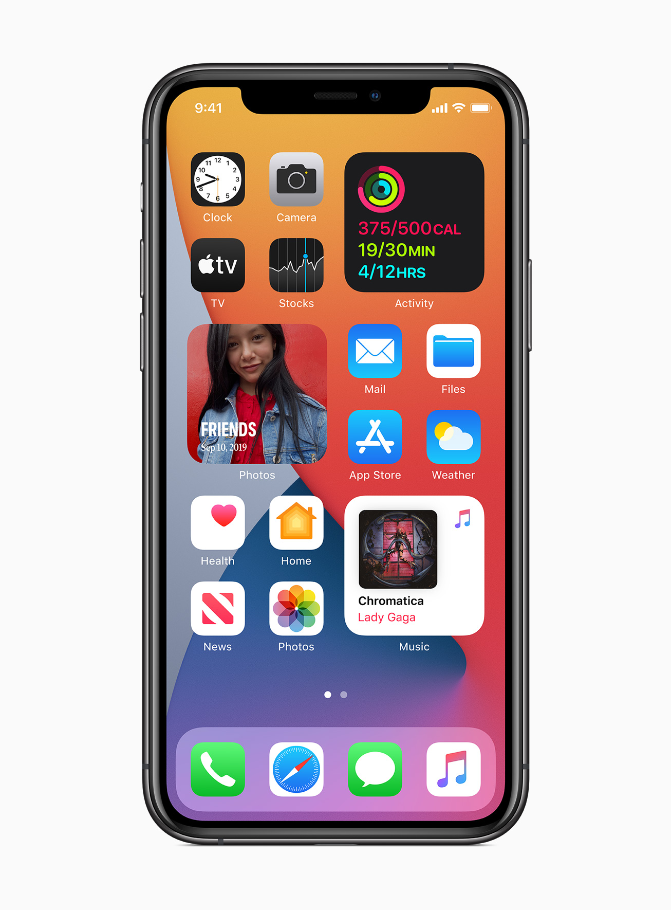
iOS 14 brings users the ability to include data-rich and focused widgets to their home screens.

Widgets aren’t new to iOS, but Apple has rebuilt the design and functionality. Widgets in iOS 14 will allow users to quickly engage with the most important information from their apps, without leaving the home screen context. Users will be able to select different widget sizes and placement to customize the layout of information on their home screen.
Unfortunately, widgets are losing the capability for interactions; widgets will only display content, and tapping on a widget will bring the user into the app.
While I am dismayed by the removal of user interaction, I am excited to see how widgets and app clips work in conjunction to empower users to use their devices in more focused and intentional ways. Both app clips and widgets focus on the user having the functionality or information that they need most in a given moment.
Recommended WWDC Sessions
Let us know what your WWDC 2020 takeaways were, we’d love to hear!


