These days, mobile prototyping tools are harder to keep up with than Netflix’s original series. In just the last two weeks, we saw the public release of Figma, a major update of Atomic 2.0, and the sunsetting of Pixate. It’s not surprising if your reaction is to want to hide under your desk until someone comes out on top. But is it possible to find one tool to meet all your prototyping needs? Is it worth waiting for one to finally emerge? Is that even what you want? It’s up to you.
What’s the best tool to use for prototyping?
While some may try to find the one-tool-to-rule-them-all, I find myself leaning on different tools for my different desires. Some are better at whipping up wireframes to demonstrate an idea. Some are indispensable for experimenting with animations and transitions. On a given project, I will often end up switching between tools to match my needs of the moment. Here are the some of the use cases for the various tools.
Showing an Idea
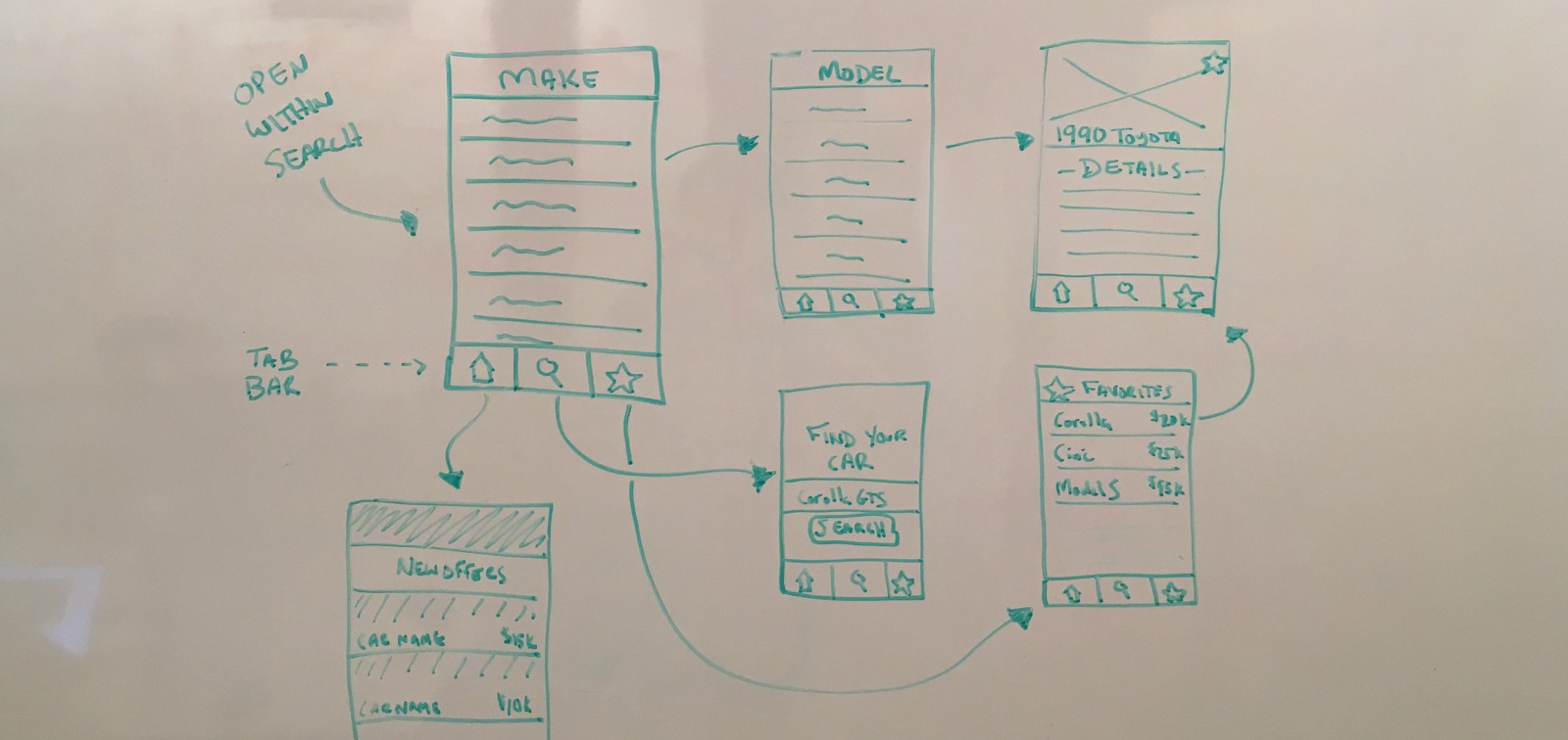
A picture is worth a thousand words. And sometimes, wiring those pictures together to show how they’re connected is worth even more. When working with your team to express an idea for a feature, there’s no need for high fidelity. What you’re really trying to show is a flow or set of interactions. For these cases, start with whiteboarding, sketching, or throwing together some quick wireframes in Sketch. Then you just have to capture and connect them.
- POP is purpose-built for this very use case, and can be accomplished right on your phone. Quick and simple.
- InVision can do the same if you’ve got a laptop handy, and can scale up to demonstrating the flow of an entire app very nicely.
High-Fidelity Design
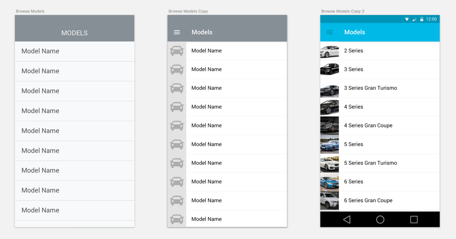
As you’re trying to increase the fidelity of your design, it’s time to open up your favorite design tool. For most of us, that means Sketch. There’s not a whole lot of contenders in this category (although Subform sure sounds interesting), but it’s worth mentioning that your experience in Sketch can be heavily adapted through plugins. If you have a chance, make sure you try things like Craft, Fluid, and RenameIt.

Interactions, Animations, and Transitions
Now that you’ve established the flow through your app and designed some of the screens, it may be time to start thinking through interactions and transitions. Want to try animating a form once you’ve submitted it? There’s a tool for that. In fact, there are dozens of tools for that. Here are just a small sample worth checking out, in no particular order
- Principle is a go-to tool for experimenting with scrolling, pagination, and advanced animations. It gets a bit unwieldy as you start to add too many screens, though.
- Flinto isn’t quite as advanced with its animations as Principle, but where it sacrifices power, it makes up for it in ease of use. Also much more comfortable to work with when you have more than 2–3 screens.
- Framer is for those of you who are comfortable with JS, and it gives you all the power you could ever want. A bit of a steeper learning curve, but sometimes it just helps to think of these things through code.
- Origami is a bit of an outlier on the list in terms of its interface, but it’s worth mentioning it as a quick, modular way to build prototypes for iPhone and the Apple Watch.
Collaboration
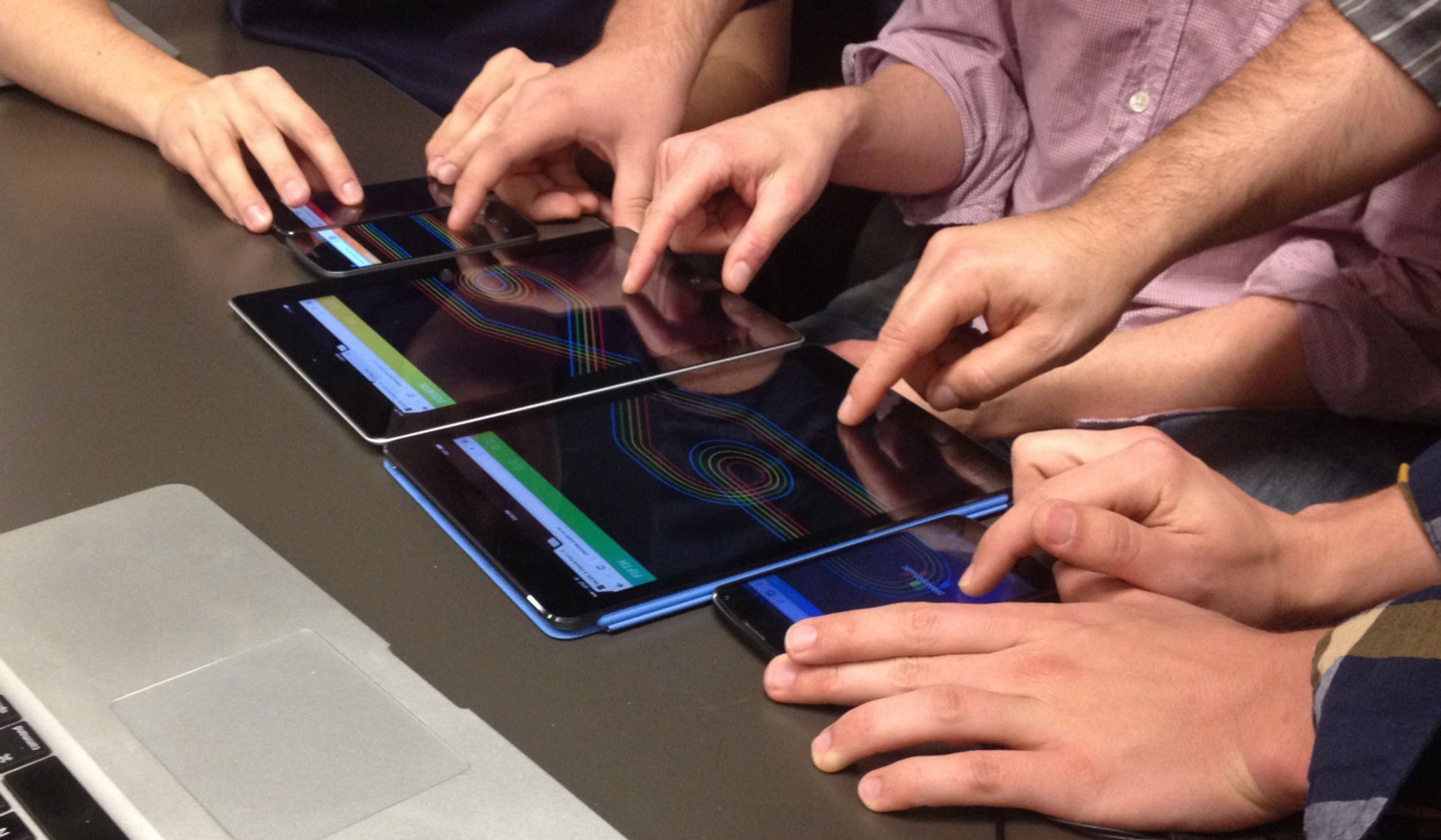
As a designer, you’ll often be working on a team. The importance of collaboration can’t be emphasized enough. As a designer, you should become best friends with your team: clients, product owners, developers, and fellow designers. But sharing your Sketch files probably isn’t the ideal way to work together. Fortunately, there are tools to help solve this pain. Just remember that no tool should replace close communication between team members.
- Figma is new on the scene, but it’s aiming to be the “Google Docs of design.” Next time you’re working on the same interface with other designers, it might be worth uploading your Sketch file and seeing if it works for you.
- Zeplin is built for hand-offs from design to development, and it’s become one of my favorite tools. It’s simple, and it just works.
So What Do I Choose?
Prototypes are meant to answer a question. Keep your prototypes small enough to answer the question at hand. Don’t be afraid to create different prototypes using different tools. You may use InVision to demonstrate the flow one day, then switch to Principle to answer a usability question the next. Avoid building your whole app as single prototype, featuring the full flows and interactions. It is likely to become a maintenance nightmare and will only detract from your time spent improving the mobile experience or working with your development team.
Familiarize yourself with an array of tools. Then you can reach for the one best suited for the job at hand.
At the end of the day, the tool preference is your choice as a designer. Start by asking yourself what problem you’re trying to solve, then use the tool with which you feel most comfortable solving it. If you want to try a new tool, most of them only require an afternoon to learn. Prototypes are meant to be quick to build. Keep them focused and stick with tools that will keep you moving. You don’t always need a hammer.


