

Form submission errors are a common problem on the web. Despite Developers best efforts to create simple and intuitive forms, users often enter incomplete or inaccurate data. The more complex the form, the more chances for user error.
Most web users are familiar with the messages prompting them to fill in a missed query or to edit faulty data. If there is no message guiding the user to the error, this may create confusion or distrust and cause the user to abandon the experience. Imagine the frustration caused by a complex form which would simply fail, with no indication of where the error had originated, or would proceed through multiple phases, but then fail to process in the end with no explanation. Few users would have the time or patience to persist.
For the estimated 246 million people worldwide that have severe visual impairments, this scenario is commonplace when using a screen reader. This is especially true for forms that collect data asynchronously. Without a page refresh a screen reader user has no indication that anything has happened at all. This is especially frustrating when using these forms may be the best or only option for participating in school, work or administrative tasks. Digital data has revolutionized the way the visually impaired can participate and communicate on many levels and thoughtful, accessible design is needed to facilitate these possibilities. Including these considerations in the design process ensures that users with low vision are not excluded and is required for Section 508 compliance.
The Solution
Fortunately, there are ways to inform users with vision impairments about invalid inputs. By default, screen readers written using the proper markup will announce actionable elements. Screen readers will also announce elements with certain ARIA attributes applied to them. By using these methods properly we can help non-sighted users easily identify errors in inputs.
ARIA is an acronym for accessible rich internet applications. https://www.w3.org/WAI/intro/aria These html attributes were developed to aid impaired users to navigate web sites and applications.
ARIA Live Error messaging
Error messaging is typically displayed under or around an invalid input upon submit or blur. The messaging can be injected via javascript or just hidden until it’s triggered by an invalid input. Aria-live is an html attribute that tells the screen reader that a new element has been introduced to the DOM (Document Object Model).
Using the aria-live attribute on an active error message informs a screen reader user of the change. Aria-live can be placed on hidden html elements and when they are revealed via javascript they will be announced to the user. Aria-live will accept the values: off, assertive and polite. Using the “polite” setting, the content will only be read once the user is idle and will not interrupt a current action. The “assertive” setting will be read immediately, and “off” is the default. Using the the “polite” setting is generally preferable. This approach is a quick and easy way to make your form’s errors accessible.
<input class="input-input" id="name" name="name" type="text" required/>
<label class="input-label" for="name">Name</label>
<span id="nameError" class="input-error-message" aria-live="polite">Name invalid</span>
Screen reader error messaging block
When a sighted user submits an invalid form they are usually given visual error messaging that tells them what is wrong. The same should be done for a screen reader user. This can be achieved by creating a block of html to store errors just for screen reader users. This block of html should be hidden from non-screen reader users so there are no duplicate error messages displayed and should only be available to screen reader users when errors are present.
When a screen reader user submits an invalid form, the browser focus is moved to the error block with javascript. The screen reader can then read off the validation messages.
If the form contained several errors it could be difficult for a user to retain all the messages at once and then fix them. It would be better to give the user an overview of how many errors there are and the option to go and fix them one at a time. This can be done by making the overview message a link. The overview message link would focus the first input error message, then the input error message link would directly focus the user to the invalid input.
This video has sound so turn up your volume 🔈
The user flow
- User submits an invalid form
- User is focused on the overview message link and the screen reader announces:
There are n errors in the form you submitted. Review Errors.
- User selects the overview message link
- User is focused on the first error message link and the screen reader announces:
Name is required. Fix invalid input
- User selects the error message link
- User is focused on the first invalid input and the screen reader announces:
Name is required, Fix invalid input
Example
What we want to do is create some html to contain our screen reader errors and use javascript to move the browser focus to the actionable elements.
- add a HTML link tag at the top of the form to hold the overview message link.
<a class="sr message-link" href="#" id="screenReaderErrors"></a>- add a HTML block of input error messages for each input in the form below the link. Create a way to map the messages to the form inputs. In this example I’m using data attributes.
<div class="sr message-list">
<a href="#" class="message message-name" data-input="name">Name is required. Focus invalid input</a>
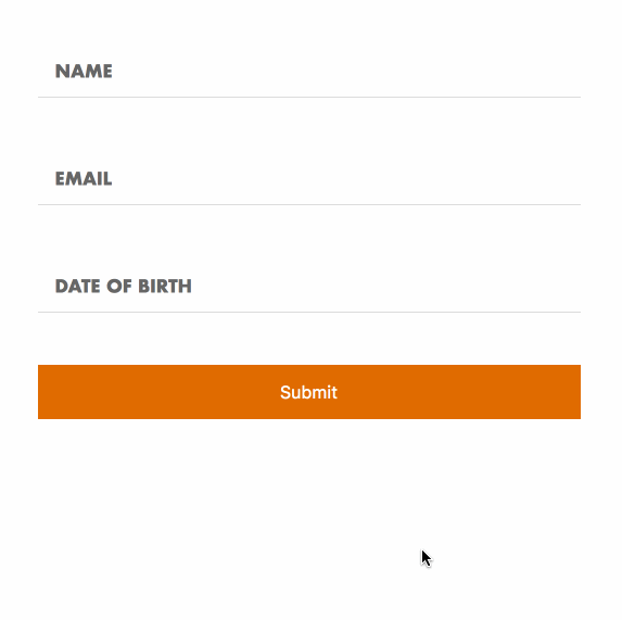
<a href="#" class="message message-name" data-input="email">Email is required. Focus invalid input</a>
<a href="#" class="message message-name" data-input="dateOfBirth">Date of birth is required. Focus invalid input</a>
</div>- hide the messages from both screen reader and non-screen reader users with CSS
.message-link,  .message-list, .message {
  display: none;
}- create a screen reader only class - (lifted from bootstrap) and apply it to the .message-link and .message-list
.sr {
  position: absolute;
  width: 1px;
  height: 1px;
  margin: -1px;
  padding: 0;
  overflow: hidden;
  clip: rect(0,0,0,0);
  border: 0;
}- on submit validate the form and handle the errors (In this example I’m using built in browser validation, for production code you would want a more robust solution.)
form.on("submit", function (event) {
  event.preventDefault();

  if ( checkFormValidity(this) ) {
    alert("Valid! Form will submit");
  } else {
    handleFormErrors();
  }
});- using javascript count the number of invalid inputs and inject the error overview message text, add an active class, and add focus the link
function handleFormErrors() {
  var count = 0;
  for ( var i in formValidation) {
    if ( formValidation[i] === false ) {
      count++;
      addError(i);
    }
  }

screenReaderErrors.html("There are "+count+" errors in the form you submitted. Review Errors.")
                  .addClass("active")
                  .focus();

}- if the form is invalid add an active class to the corresponding message via javascript that will override the
display: none
.message.active {
  display: block;
}- handle the click event on the error overview message link and focus the first input error message
screenReaderErrors.on("click", function(e){
  e.preventDefault();
  messages.addClass("active")
          .find(".message.active:eq(0)")
          .focus();
});- handle the click event on the input error message and focus the input
messages.on("click", ".message", function(e){
  e.preventDefault();
  var input = $(e.currentTarget).data("input");
  $("#"+input).focus();
});
See the Pen Form Accessibility by Greg Genovese (@ggenovese) on CodePen.
These simple changes ensure that all users have a positive, or at least functional experience using the form as designed. By making accessibility consideration a norm in development we optimize web use for the greatest number of users. While this post is directed specifically at low vision users, this format could be used by people who understand a spoken language, but do not read it well and, as web use moves away from keyboard-based communication, auditory input will become more important in common use.