I recently delivered a workshop at the 2017 Connected Health Conference in Boston on “Using the Power of Design Thinking to Build Connected Health Products People Love.” You can view the workshop slides here.
Several years ago, the designer Jonathan Shariat wrote an arresting blog post entitled “How Bad UX Killed Jenny.” It’s a cautionary tale for anyone working at the intersection of technology and user experience.
It describes how a young patient recovering from an aggressive cancer treatment died in a hospital due to a lack of hydration. Although hydration was part of the recovery protocol, and despite the fact that the nurses on staff each had over ten years of experience, something went terribly wrong. How did they miss this critical information when the charting software was developed precisely to ensure that each step in treatment was taken and properly recorded?
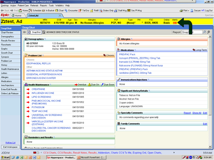
Shariat recommends we take a more careful look at the software itself. This screenshot suggests how its design exports complexity and confusion onto its users:

Because the software user interface is so cluttered and unintuitive, it’s not unreasonable to ask what responsibility it bears for leading three highly trained and experienced nurses—over not just one but multiple shifts—to miss essential information necessary for Jenny’s recovery. As Shariat puts it:
When most of us design a User Interface, and fail at basic usability, the worst that happens is that our product fails. Yet, when the designers of this system, or even an airplane’s cockpit, fail at their design, there are real physical harms. With so much on the line, you would think these industries would have hired the best designers in the world to carefully craft the User Experience. But they don’t.
Now, imagine the complexity that arises when user experience is distributed across multiple screens and physical devices, perhaps in something like an intelligent insulin injector—an object that senses, captures data, and communicates to patients and caregivers. It’s a physical device on the body, possibly also a companion phone or smartwatch app, and it may have some connection that sends data to the EMR, a doctor, and nurses. The value it provides manifests in many interactions—some directly with the patient, others with the healthcare provider, and still others with the payer—across many different contexts, interfaces, and interactions. Each of these is its own unique UX challenge. When combined, the permutations create such complexity that, for even the best designers, it can result in unintended consequences.
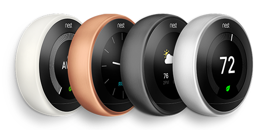
Let’s use an example outside of healthcare to illustrate some critical points related to good UX/UI design for connected products. Take Nest, founded by Tony Fadell, the so-called ‘godfather’ of Apple’s iPod, the company offers several connected smart-home devices.

Its first product, the Nest Thermostat, is a study in good design. It’s nice to look at, it’s easy to use, and it solves a very real problem—that programmable thermostats are such a pain to use that most people simply give up trying to program them. This is why the federal Energy Star program no longer recommends them. The EPA found that programmable thermostats were so confusing that energy use could actually go up with their use—far from helping, they actually delivered harm.
Nest solved this problem by employing sensors and intelligence to learn and predict people’s schedules. As schedules change, it learns and adapts accordingly. It also uses game theory to reward its users with a ‘leaf’ if they conserve energy. Heating and cooling is so much more efficient this way that people save an average of 10-15% each year.
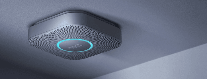
Nest’s second product is a smart smoke detector, the Nest Protect. Like the thermostat, the company considered all the things people don’t like about smoke detectors—they’re ugly, they have false alarms that are hard to silence, when it’s time to change the battery they invariably start chirping at 3am—and redesigned those experiences. But smoke detectors are highly regulated. In the video below, we see a different kind of frustration at 3am:
This enthusiastic early adopter installed multiple hard-wired detectors throughout his house—and, as it happens, had a false alarm. Although the Nest includes a large, easy-to-push button to silence it, regulations at the time required that you silence the originating alarm. It makes sense—that’s where the detector thinks there’s a fire. Yet, when detectors are networked, they all go off at the same time. Unable to determine which one will silence the chorus of alarms, the homeowner rips them all off of the ceiling and throws them away. Despite being designed by some very smart people, who cleverly addressed a variety of problems, Nest delivered a product that failed.

This example illustrates that there’s added complexity to consider when moving from a discrete product to a connected product. When selling a discrete product, it’s a simple transaction—the purchased product goes out into the world as a standalone entity. Think of buying a hammer: once you have the hammer, the transaction is complete, you have the hammer, and that’s it.
A connected product is fundamentally different. It maintains a connection between its designer and user across multiple transactions, over time, and for a variety of reasons. Rather than a simple transaction, it’s a relationship built on a service. The promise the product makes is no longer static but dynamic.
This allows for the value of the product to change over time. Micro-transactions can suggest new ways to use the product based on context and perceived need. The product can actually alter its design and capabilities through software updates in the field. It gathers, stores, analyzes—and, importantly—acts on data so it can adapt and become increasingly user-friendly and valuable over time.
This means that there are at least five new things to consider in designing connected products:
- It’s no longer a single transaction. It opens a channel between the designer and the user, which is maintained over time through many distinct transactions and interactions. How are these experienced?
- It’s no longer a simple physical artifact. Whatever form the hardware takes, its design must accommodate sensors, software, a service layer, and data. Is it clear and frictionless as its capabilities evolve?
- Data is the glue that binds the pieces together. Data needs to be managed and is an essential component of the user experience—what is the user told? and why? and when? How does this affect understanding and use of the product?
- They exist within lived contexts. Connected products are often intimately associated with the body or with highly personal data. Do they fit seamlessly into life? Does the design consider not just utility but also emotion, security, privacy, and personal preference?
- Together, these express a long-running service. The product is a container for the service and the service is the primary way the product delivers value. Because service is substantially invisible, it often occurs by default. Is the service intentionally designed?
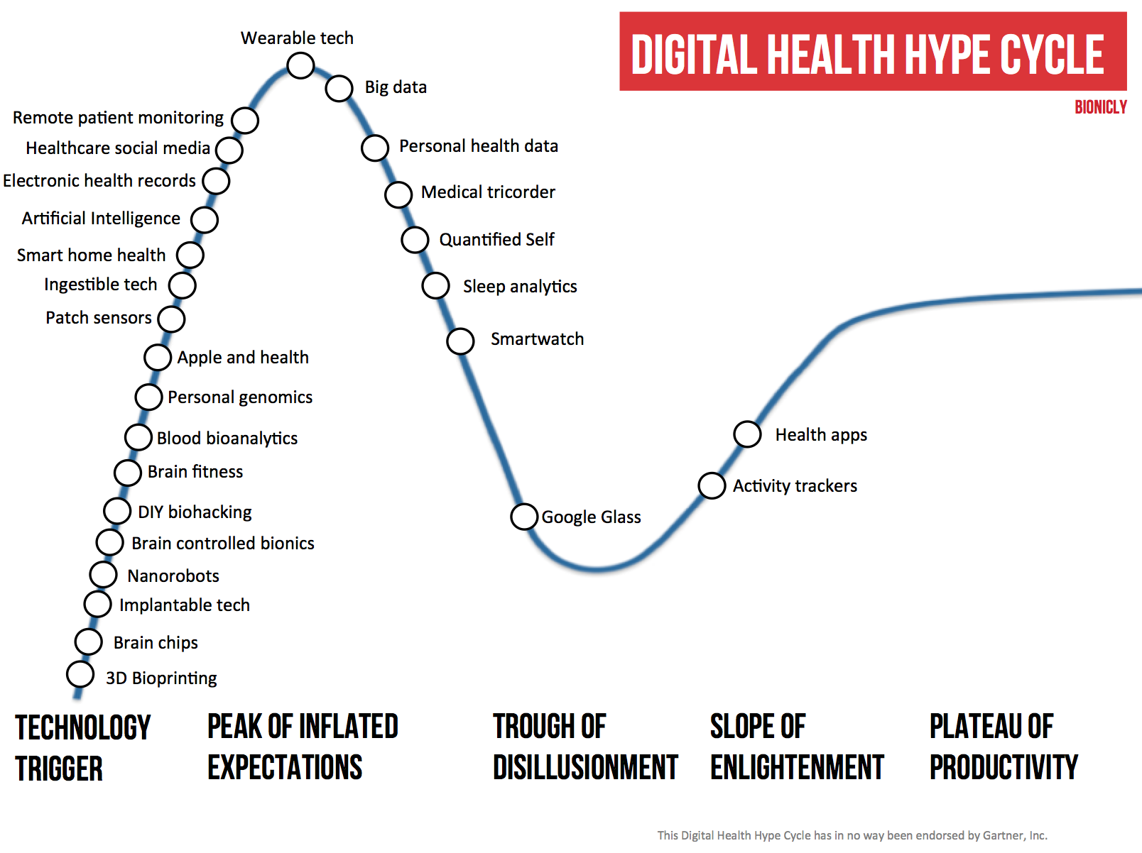
When we look across the landscape of digital health products, it’s at the stage where it provides more promise than impact. Using Gartner’s famous ‘Hype Cycle,’ Bionic.ly places most of these products at the ‘peak of inflated expectations’ or the ‘trough of disillusionment.’

This shouldn’t be surprising. The Internet of Things (IoT) is still new. In 1996, a website could cost millions of dollars, while today a standard website is quick, inexpensive, and easy to build and launch. When it comes to IoT, we’re in the same place we were with the web twenty years ago.
So, how do we tame this complexity?
We believe that the key is in deeply understanding people—patients, clinicians, and everyone else involved in the service. While experience and technology are tightly coupled, leading with people will give you the necessary clarity and stability around which to base your product strategy. Take the example of medication adherence.
The World Health Organization says increasing adherence would be like a blockbuster drug in its impact on both health and economic outcomes. If only patients followed the directions of their healthcare practitioner, there’d be fewer hospitalizations, complications, and deaths. Studies peg the savings at over $7,000 per patient each year for those with congestive heart failure and almost $4,000 for those with diabetes.
What stands in the way? The research indicates that people either don’t understand—or don’t believe—the directions they’re given. People often perceive medical direction as something imposed on them. This is fundamentally a question of moving from an imposed set of directions to intrinsic motivation. It’s key to changing patient behavior. Far from a technical challenge, it’s a question of human need, desire, and agency.
The key variable in all of this, then, is the patient. In an era where digital tools and connected products give patients more power and autonomy than ever, the promise is a world where patients can do more for themselves—greater understanding, empowerment, and control. But as illustrated earlier, if highly-trained nurses with decades of experience can make a fatal error because of software, what hope do patients have in a world of connected products if those products aren’t truly designed for them and the people who care for them?
Putting patients at the center of healthcare and connected health product design is critical. Connected health products can be game-changing, but only if they’re designed with the patient, and patient’s best interest, in mind. We need to stop thinking of healthcare as something that is done to patients, and instead start thinking of it as something that we do with patients. A good place to start is in the design of connected health products.


