
While working on a web app to make it more accessible, a coworker received an interesting request from the client’s QA department.
The Situation
Recently, the client became aware of the importance of accessible software and is now working to retrofit their products to be compliant with accessibility standards. The process is a detailed and nuanced endeavor, requiring coordinating updates across a large and complicated application.
When it comes to doing accessibility work, teams not familiar with the practice have to adopt a different mindset of how the user experience affects their customers. It’s more than just “Does this feature work for me on my computer?” It requires knowing what issues to look for, how to test for them, and how the end user actually uses assistive technology.
The application’s size and complexity is a result of the volume of information it must track. To support this, the client has a great deal of development talent, as well as a large QA team to assist in catching bugs. The stakes are high—the information is highly sensitive and thoroughly regulated.
The Request
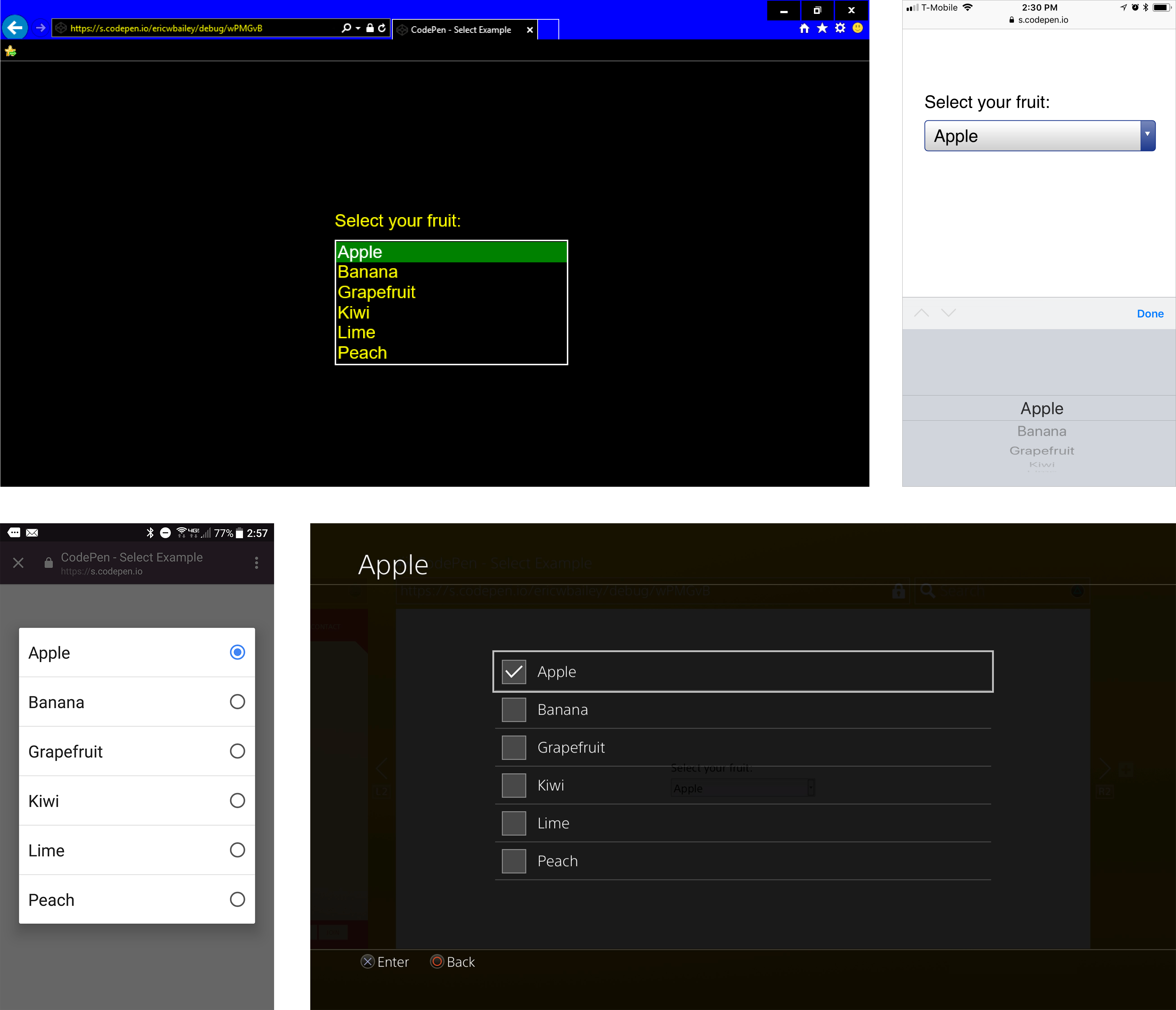
Here is how three of the major screen readers read a native HTML select menu:
VoiceOver
NVDA
JAWS
QA wanted to make the component, a select menu, sound the same in every screen reader.
Taken at face value, the request makes sense. One aim of good design is to create a predictable experience for the user. In Inclusive Design, that principle is even more important. Shouldn’t it apply all the more to screen readers? Not necessarily.
Digging a little deeper into the request, we run into a larger concern: abandoning external consistency.
External Consistency
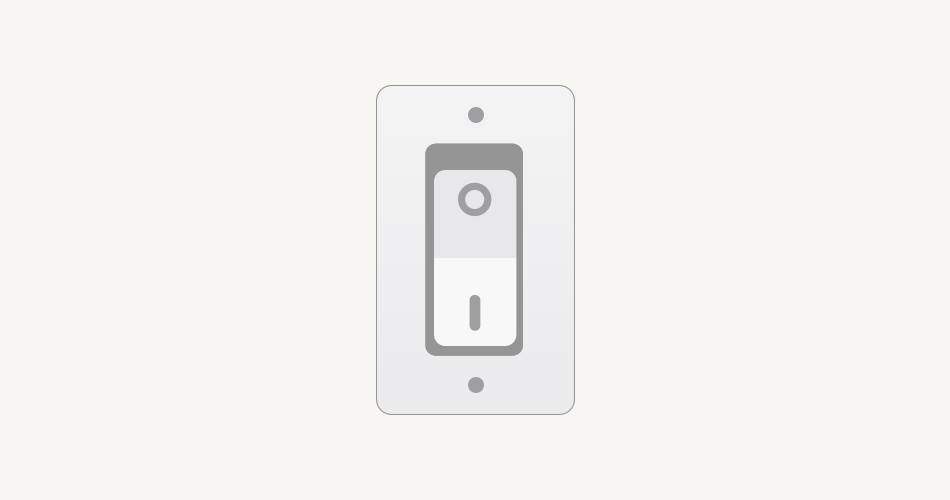
External consistency means that similar tools behave in similar ways.
It’s how you know a light switch in your friend’s house works the same way a light switch in your house does. Or how you can be up and driving in minutes after renting a car. Or how you don’t need to learn a new alphabet every time you read a new book.
On the web, external consistency does a lot of the heavy lifting. Think of the kinds of content you interact with every day: buttons, links, text inputs, radio buttons, checkboxes, labels, headings, etc. Next time you go to a new website, pay attention to how you can naturally intuit how to operate it.
Making websites accessible means ensuring that everyone can use them, regardless of ability or circumstance. Predictability is a huge factor in ensuring this.
The Problem
Given it is reading proper semantic markup, each screen reader behaves consistently, in that it enables the user to navigate, read, and operate web sites. However, there are slight differences among the different screen reader programs—much like how each web browser looks and operates slightly differently.
This is by design. Each browser and screen reader has a different philosophy on how their users should interact with them. It’s a balancing act between the product’s features, the operating system it is installed on, the form factor it is available in, and the types of input it can receive.
People, including those who navigate via screen readers, switch websites far more often than they switch browsers. Because of this, the issue of nonstandard interactions between websites outweighs the discrepancies between the different language screen readers use to describe content.
Honoring the request and using non-semantic HTML to recreate the menu in code in such a way that it sounds the same in every screen reader breaks external consistency. While the select menu might be visually the same as the native counterpart, making the site behave differently from other sites makes it awkward and unfamiliar for everyone to operate.
Think of it like rewiring your house’s light switches to turn off the shower’s hot water. While you might think it is the proper way to regulate temperature, your houseguests may voice some complaints.
In addition to breaking external consistency, custom select menus are surprisingly difficult to make. Many designers love to create their own take on the input type, but typically fail to accommodate all the different ways its controls can be accessed and presented.
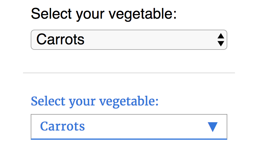
I don’t know about you, but I’d much rather have something ugly yet functional rather than something pretty but unusable. You can find a middle ground, in that the resting state of the select menu can be altered via CSS to match the rest of your site’s design. Just make sure the design has a good font size and color contrast ratio, enabling everyone to be able to read it.
Not all keyboard users are screen reader users, and not all screen reader users are keyboard users. With a native select menu, I love that I can type the first letter of an option to jump to it (especially when selecting my country in a checkout form). In a rebuilt custom dropdown, this convenient feature won’t work unless the developer put in extra work to support it.
The Solution
My coworker pushed back on the request and advised the client to use native select menus. Education was key here: we explained that standard select menus have intentional, helpful behavior, and that altering them without reason has a cost.
We also framed using native select menus as a value proposition: their code is far more robust than any custom-built replacement, meaning QA testers spend far less time and effort ensuring they function properly (to say nothing of regression errors popping up in thousands of screens and states). Getting more by doing less? Sounds great to me!
Don’t get me wrong, I think it’s great that the client’s QA team is including a screen reader in their testing process. In fact, it’s something I wish more companies would do. But it is vital to know not only how technology functions, but also how people who rely on it daily expect it to work.
Making your product accessible can be difficult, but you don’t have to go it alone. We design and build digital products and services that seamlessly integrate into life, with experience making responsive and native apps, connected IoT products, as well as enterprise-grade technical design. If this sounds appealing to you, get in contact today!