
As a designer working on digital interfaces and applications, there can be a lot to keep in my head. At any given moment I’m sketching and testing different interaction patterns, prototyping and validating new functionality with users, and putting the final visual polish on high-fidelity designs. Mental space can be hard to come by and, like it or not, there are times where seemingly small details can get overlooked if I’m not thoughtful about my process. These design omissions can actually impact overall experience significantly more than their pixel value would suggest; and therefore, they need to be actively considered.
There are five basic areas of design that are easily forgotten as we sketch, iterate, refine, and implement digital apps and interfaces. While, at first pass, they might seem small or not important to your primary audience, each of these common omissions can actually have measurable impact on usability. Skipping them completely, or simply tacking them on at the end of a project, hurts users and ultimately hinders your project’s success. Without further ado, here are The Forgotten Five:
1. Button States
Good button states and cursor indicators help digital experiences feel faster and more responsive to a user’s commands. Thoughtful utilization of the basic hover, active, and visited states go a long way towards helping users understand what actions are available to them. For more complex interactions such as within a drag and drop interface, subtle animations can help extend each of these states and provide even more clarity. Button states show how the app is responding (especially important in low bandwidth situations) and they help users explore and develop a mental map of the app or site.
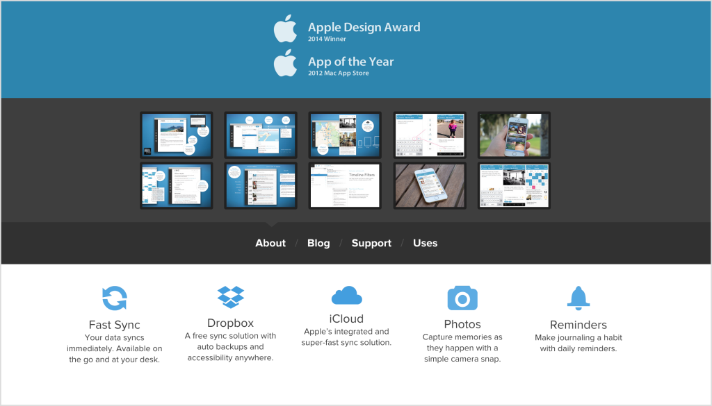
The website for the Day One journaling app shows a good variety of button states for example. By visiting the site you’ll see just below the hero shot three distinct hover states which alert the user to clickable elements with different levels of priority and emphasis. A similar variety of styling options are available for other button states as well, and we must remember to keep them in our arsenal of design tools.
Thoughtful utilization of the basic hover, active, and visited states go a long way towards helping users understand what actions are available to them.
2. Accessibility Cues
Making [accessible digital interfaces](https://cantina.co/making-accessible-digital-products/) for all types of users can seem daunting, but it’s an important aspect of any project. Remember that not all users of your site are the same. Many don’t have a Retina screen, perfect vision, or the motor control to use a mouse. Users with visual, motor, or other impairments digest content in different ways and we need to consider these viewing methods from the start of the project.
Accessibility is both a technical hurdle and a design challenge that requires thoughtful work without a lot of glory. A good designer will put in the time up front, and find elegant solutions for those surfing with a keyboard or using a screen reader. Common accessibility design omissions include not specifying additional selected states and failing to plan a logical tab order throughout the page. Not all accessibility cues can be designed ahead of implementation, but designing with accessibility in mind is too important to forget.
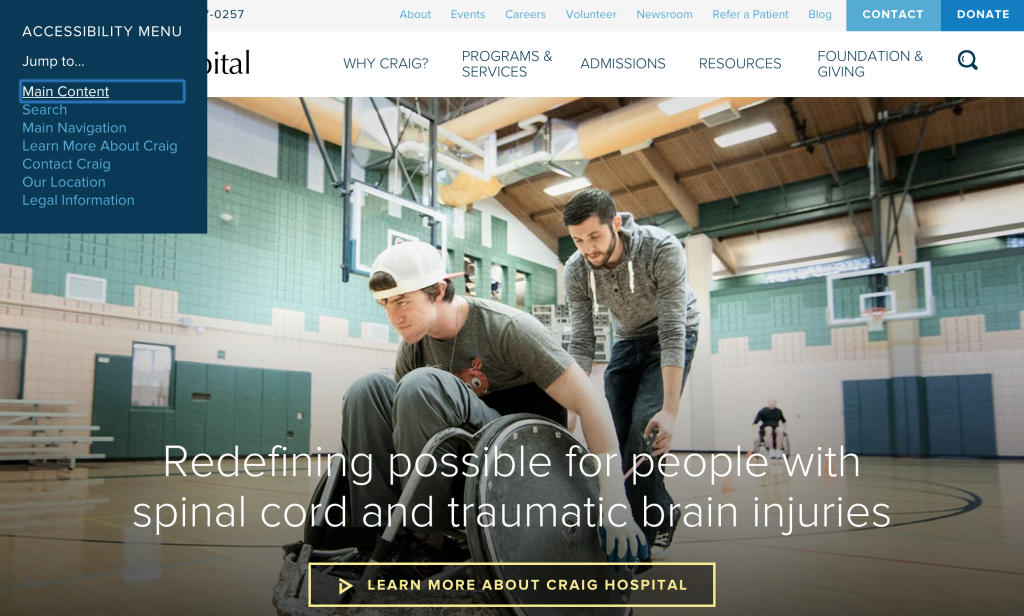
The website for Colorado-based Craig Hospital demonstrates successful design of accessibility cues. Upon arriving on the site and hitting the tab key, keyboard users are immediately presented with a custom accessibility “jump to” menu, and then led through a thoughtfully planned main navigation path. In addition, the active indicators have been designed big and bold without breaking the clean, crisp brand aesthetic established on the rest of the site.
Accessibility is both a technical hurdle and a design challenge that requires thoughtful work without a lot of glory.
3. Empty States
Empty states, or views that don't yet have any data to show are another area that can have a huge effect on user satisfaction if not designed well. Empty states can be confusing or they can be engaging calls to action. By actively designing what pages and elements look like when no data exists we can show users what they should do next to add data or take full advantage of the site. These views also present unique opportunities to be clever and creative. As one of the few views where minimal information needs to be squeezed onto the screen, we have more real estate to use illustrations, icons, or some other form of visual interest. Empty states are great opportunities to creatively reinforce a brand message, while helping users understand what to do next.
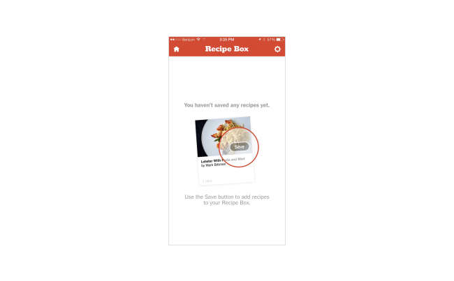
The New York Times Cooking App has a great example of these design patterns in their Recipe Box. When a user doesn't have any saved recipes, the app first makes it perfectly clear that the view is data-less. It then goes on to both show and tell the user how they can add recipes, even highlighting the exact UI they will use. The text descriptions are clear and thoughtful and a simple visual brings the whole view together.
Empty states are great opportunities to creatively reinforce a brand message, while helping users understand what to do next.
4. Micro-copy and Alerts
Another element that is often forgotten during the design phase is micro-copy and how short messages can be presented confirming actions, highlighting errors, or displaying feedback. The moment after a user enters something and clicks submit is always tied closely to emotion (read user experience) and yet sometimes we forget to design these moments until the interface is being developed. We can't leave such a critical moment of experience with our app to last minute suggestions. The display methods we use, and the personality we express through micro-copy can be either a big win or a missed opportunity in connecting with our users.
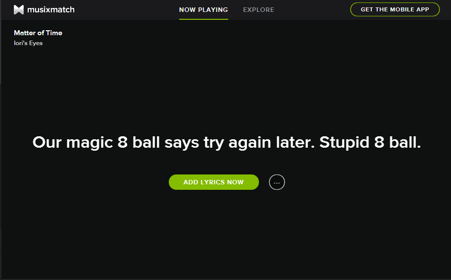
Great micro-copy can be found throughout the Spotify desktop app. One fun example is found within their Musixmatch powered lyrics integration. After searching for song lyrics, the app displays humorous excuses if it fails to find any matches. This lightens the mood a bit and hopefully minimizes user frustration. Incorporating a bit of personality in situations like this can be beneficial when designed intentionally and we can't forget the value of these moments.
The moment after a user enters something and clicks submit is always tied closely to emotion
5. Branded Snippets
The last of the forgotten five is probably most excusable because of its relative newness, but in today’s share-everything world it shouldn’t be skipped over. When a link to a webpage is shared, many current platforms automatically pull in metadata about the page giving users a preview of what they’ll get by clicking. This starts with the basic page title and description tags, but some platforms are also now including a branded image, the site favicon, and other key page attributes (Facebook’s Open Graph Protocol and Twitter’s “Cards” functionality are probably the two highest profile examples of this metadata sharing). These types of information extend the identity of a page, article, or product and make it more appealing when posted to other places. As designers we should actively design these images, favicons, and even the language that is built into the metadata of our sites. By designing for these situations we can help extend the reach of our pages and bring a branded presence to digital spaces far removed from our actual domain.
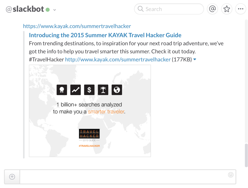
Kayak.com does a great job of designing all these branded snippets as shown in the example below. By simply pasting a link into a platform like Slack, users are given a page title and custom description for the Summer Travel Hacker page (not just a global Kayak.com description). A branded image is pulled into the post and they’ve even included a hashtag for greater social reach. This branded snippet makes it easy to see where I’m headed if I click the link, and it even gives this link greater prominence within Slack’s conversation channel.
By designing for these situations we can help extend the reach of our pages and bring a branded presence to digital spaces far removed from our actual domain.
So there they are: The Forgotten Five. When these components are omitted from design, in the best case scenario, we miss an opportunity to deliver a smoother experience. In the worst case, we create confusion and friction that hinders understanding and hurts conversion. These frequently forgotten design considerations are critical as we design and deliver new apps and interfaces. While seemingly small, their impact on user experience is huge.

![Sketching for UX Designers [Infographic]](/images/blog/2015-12-02-sketching-for-ux-designers/square.jpg)