

Journey Mapping in Practice
If you’re a part of the design community, you’ve undoubtedly heard of—or perhaps are well versed in—the practice of customer journey mapping. At Cantina, we believe that to design an experience that is best for the user, we need to understand their end-to-end experience. We see the customer journey map as a diagram of the ‘holistic view of actions, influences, thoughts, and emotions surrounding interactions with your brand or organization.’
Understanding the intent and value of a journey map is not enough to produce one for your organization or client effectively. Not all journey mapping tools are created equally, and it is crucial to weigh the strengths and drawbacks of emerging software against the objectives of your design deliverables. At Cantina, we have reviewed a handful of new and well-known options for creating a customer journey map. In this article, we share some of our insights and feedback.
When reviewing any potential new tools that we might encounter, we like to think about how well they stack up against these four key criteria:
- Collaboration: How easy is it to work with colleagues on a file? How easy is it for the client to share comments? Can revisions be tracked?
- Value: Does this tool carry a subscription fee? Does the subscription have a tiered pricing structure based on user needs and roles (creator, contributor, commenter, and others)? To what degree does the service limit functionality based on price?
- Visual Control: Does the tool allow for a wide variety of aesthetic controls and customization? Is there a wide selection of assets, palettes, and visual options? Can the user input components (icons, colors, fonts)?
- Adaptability: Does the tool allow for files to be easily edited? Does the tool have version control? Are visual edits destructive? Is there an underlying logic of layers? Can files be repurposed and exported in multiple formats?
Mural
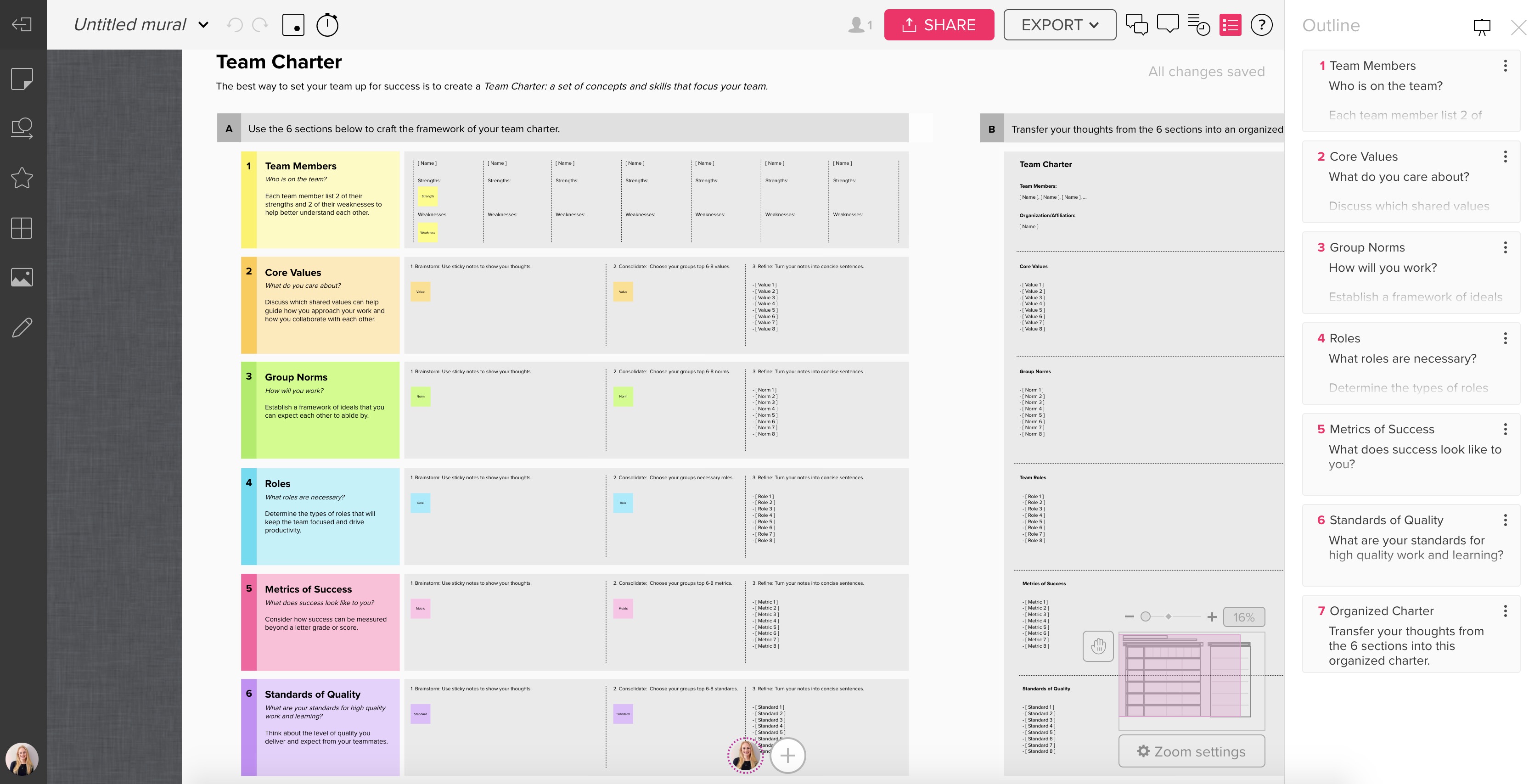
MURAL was conceived as a way to hold a virtual whiteboarding session. You can choose to begin with a completely blank canvas, or pick from a wealth of templates. MURAL strikes a unique balance between flexibility and structure. Its format encourages free-form ideation, but provides enough tools to create a relatively polished product with a carefully selected visual language of fonts, icons, and a built-in image library.
In our experience, it was possible to create an end product that looked just as complex as one made using more sophisticated design software. However, it is difficult to make sweeping changes all at once. Each edit needs to be made manually, as MURAL does not have any functionality that allows similar elements to be updated simultaneously (i.e. Character Styles in InDesign or Symbols in Sketch).
MURAL is a great option for users that need to work closely and collaboratively with teams either on-site or remotely. Mariano Suarez-Batten, Founder of MURAL explained in an interview that presenting your ideas to colleagues as a presentation always made him anxious because the format lends itself to a linear thought process and an inevitable critique. He explains that MURAL is the remedy to those pressures, so that ideas could be co-created, virtually. Overall, it is a well-crafted tool for capturing the thoughts and ideas of an entire extended team in real-time, and then refining the product visually over time.
Rating
- Collaboration: 5/5
- Value: 4/5
- Visual Control: 4/5
- Adaptability 3/5
Strengths
- Seamless simultaneous collaboration and commenting online
- Easy to use interface and clean, curated palettes of fonts and icons
- Works well on mobile (tablet and phone), even with complex boards
Items for MURAL to Explore in Future
- Adopting a familiar artboard or page approach to show multiple states side by side in the same document
- Adding a simple layers functionality to the site
- Allowing a higher degree of specificity, i.e. text size and line weight
- Minimizing lag time between requesting an export and receiving email of document
- Creating a more informative tutorial of all of the keyboard shortcuts offered in the program
Pricing Tiers
- Free Trial: 30 Days
- Student: Free with Student ID
- Starter: $12 per user/mo
- Plus: $20 per user/mo
- Enterprise: Quote Required
LucidChart
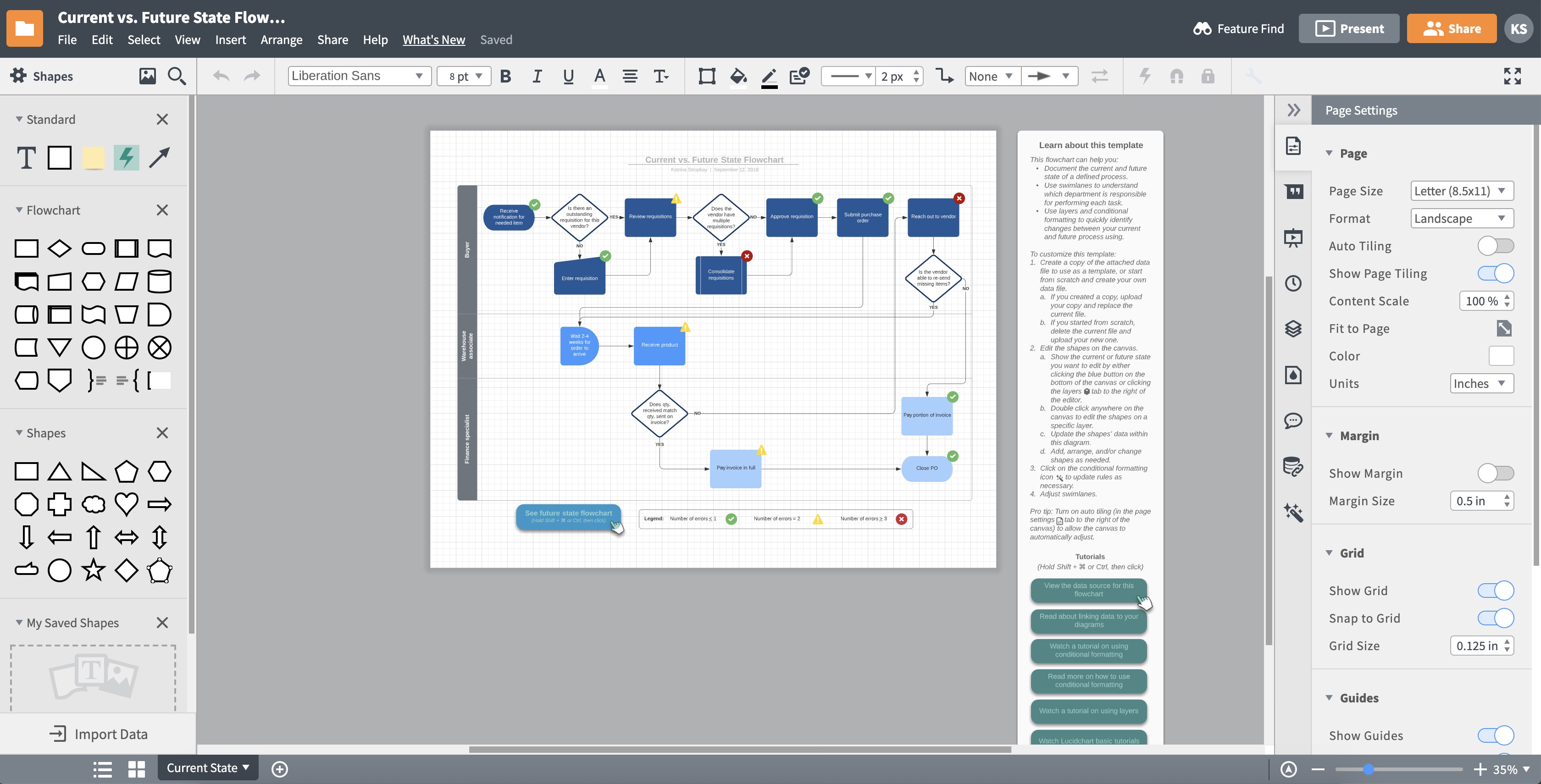
LucidChart is similar to MURAL in that it provides a whole host of templates for creating various types of documents. However, LucidChart’s main offering leans more toward business flowchart creation than design thinking facilitation. LucidChart is compatible with other productivity platforms like G Suite, Atlassian, Slack, Salesforce, and Microsoft Office, and can import data from Excel, Zapier, Salesforce, LinkedIn Sales Navigator, and others. It also provides the functionality to create an automated layouts to generate a diagram from your data. Additionally, LucidChart includes layers, pages, and detailed customization features that more prescriptive online tools lack.
While the interface is more complex than MURAL, the number of features available without a premium subscription is slim. LucidChart sits in the middle of two extremes—a design tool and a business tool—but leaves something to be desired on both ends of the spectrum. The constant pop-up notifications and pressure to upgrade to a premium subscription are a major deterrent compared to similar, free tools. But, unlike other more freeform online tools, LucidChart does have certain ‘smart’ features, like arrows that follow the item they are assigned to (even when formatting changes). This and other features prove to be hugely helpful when producing diagrams that need to be constantly in flux.
Rating
- Collaboration: 4/5
- Value: 2/5
- Visual Control: 3/5
- Adaptability: 3/5
Strengths
- High level of customizability with layers and pages
- Pre-packaged content that spans multiple industries’ interests and needs
- Valuable features for business like presentation mode and ability to import and manipulate data
Items for LucidChart to Explore in Future
- Creating a better experience for customers without premium subscriptions
- Improving User Interface to better showcase functionality and minimize distraction
Pricing Tiers
- Free Account: (Extremely Limited Functionality)
-
Basic: Single User, $4.95/mo Paid Annually $5.95 Month-to-Month -
Pro: Single User, $9.95/mo Paid Annually $11.95 Month-to-Month - Team: (3) Users, $27/mo Paid Annually - (25) Users, $225/mo Paid Annually (Tiered Pricing Structure)
- Enterprise: Quote Required
Custellence
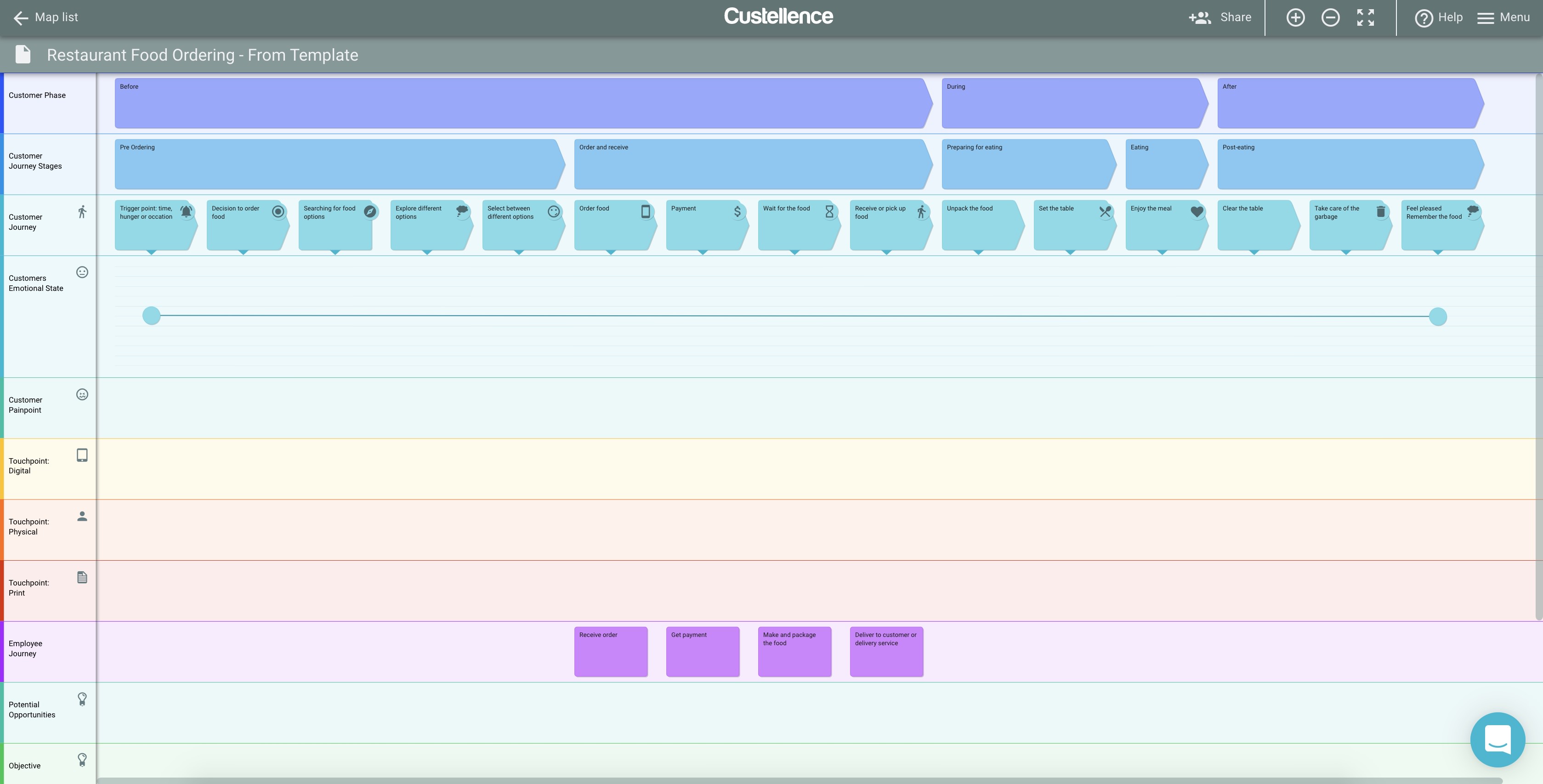
Custellence was made for journey mapping. If you are new to journey mapping, or need guidance as you fill out your map, Custellence would be a great choice for you. The software is rigidly constrained by the cascading structure of phases: Meta-phase, phase, sub-phase, individual step, etc. This is accompanied by all of the adjacent thoughts, feelings, and opportunities that correspond to those phases. Though restrictive, Custellence has created an intelligent solution for dealing with edits. If you insert a new phase right in the middle of your map, all of your other ‘card’, images, icons, steps, etc. will nudge themselves over accordingly. There is no need to manually reorder all of your other ideas when you need to add something you’ve forgotten.
If you’re curious to learn more about Custellence, there is an entire online course lead by Marc Fonteijn of The Service Design Show podcast, and Daniel Ewerman of Custellence. It teaches journey mapping, from the fundamentals through the nuances of using maps in your design business. The course uses Custellence exclusively and is great for beginners or veterans, who need a refresher on how to sell journey mapping to key stakeholders.
Rating
- Collaboration: 4/5
- Value: 4/5
- Visual Control: 3/5
- Adaptability: 4/5
Strengths
- Rigid structure assures rich, cohesive, and aesthetically pleasing maps
- Company and interface built to support journey mapping, specifically
- Ability to show and hide sub-info / more details associated with bigger buckets of information
Items for Custellence to Explore in Future
- Adding to limited template library
- Allowing more flexibility in ‘card’ behavior and placement
Pricing Tiers(Converted from Euros 9/5/19)
- Free Account: (Some Functionality Limitations)
- Educational Account: Reach Out to Company for Pricing
- Essential: $21.05 per user/mo billed annually, $33.23 per user billed monthly
- Professional: $76.43 per user/mo billed annually, $88.62 per user billed monthly
- Enterprise: Quote required, Starts at $443.08 / month, 5 Users Always Included
Adobe Creative Cloud
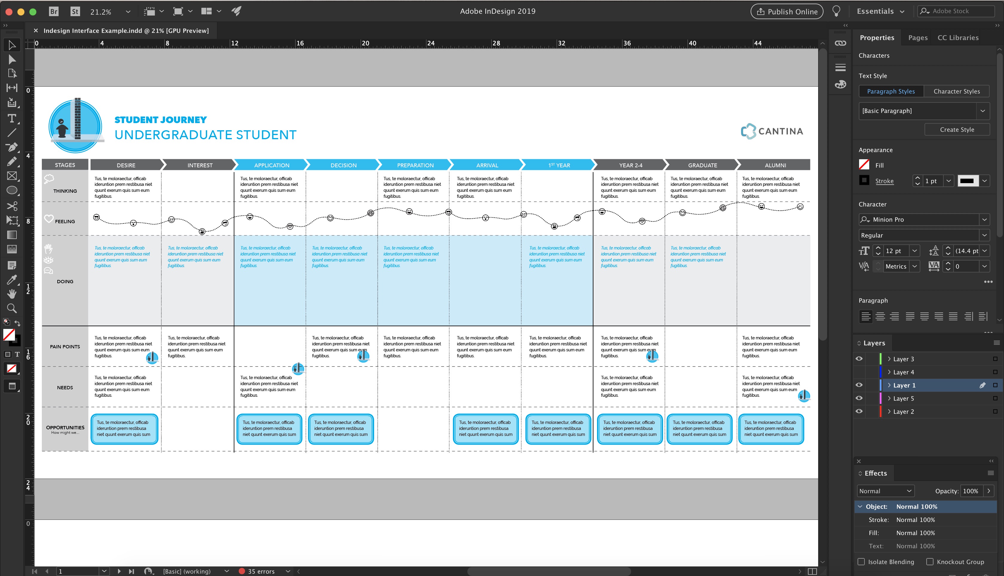
Adobe Creative Cloud is the industry standard for visual design professionals. Utilizing a combination of InDesign, Illustrator, and Photoshop, amongst the multitude of other products, is the go-to solution when creating polished graphic designs for print. But is it the right tool for customer journey mapping? It depends on the overall complexity and versatility of your final product. One of the more powerful features within the Creative Cloud (which is lacking completely in most online collaborative tools) is layers. Layers are a powerful way to express ‘before’ and ‘after’ within one file. Visually, layers allow for a build-up of information within the context of a story or pitch (rather than an overwhelming grand reveal of all your information at once.)
If your project demands complex or myriad journey maps, InDesign is a smart and reliable tool for experienced visual designers. The need for intricate workflows, custom visuals, or streamlined links between documents, are all key indicators that this advanced design software might be called for. Before diving too deeply into a Creative Cloud project, it is important to have a thorough discussion with any contributing team members, and perhaps even the client, about how your journey maps will be shared, delivered, and edited through the lifecycle of the business and you are serving.
Rating
- Collaboration: 2/5
- Value: 3/5
- Visual Control: 5/5
- Adaptability: 5/5
Strengths
- Optimal visual control for maximum artistic & strategic customizability
- Layers and artboards, to organize versions of information or states in time
- Vector and link-based file set-up, to minimize file size and avoid blurry graphics at a large scale
- Highly flexible export formats with options for interaction & animation
- Ability to work offline (without internet connection)
Items for Adobe to Explore in Future
- Version control or master file syncing (similar to Abstract in UX or Revit in Architecture)
- Simplified and optimized system for packaging and sharing links and assets
- More robust tutorial system for new users
- Potential pricing package for Id (InDesign), Ai (Illustrator), Ps (Photoshop) trio
Pricing Tiers(Based on “All Apps” Option)
- Free Trial: 30 Days
- Individual: $79.49/mo, $52.99/mo w/annual plan, $599.88 annually prepaid
- Business: $79.99/mo per license
- Students and Teachers: $19.99/mo w/annual plan, $239.88 annually prepaid
- Schools and Universities: $34.99/mo per named-user license, $330.00 annually per shared device
Keynote/Powerpoint
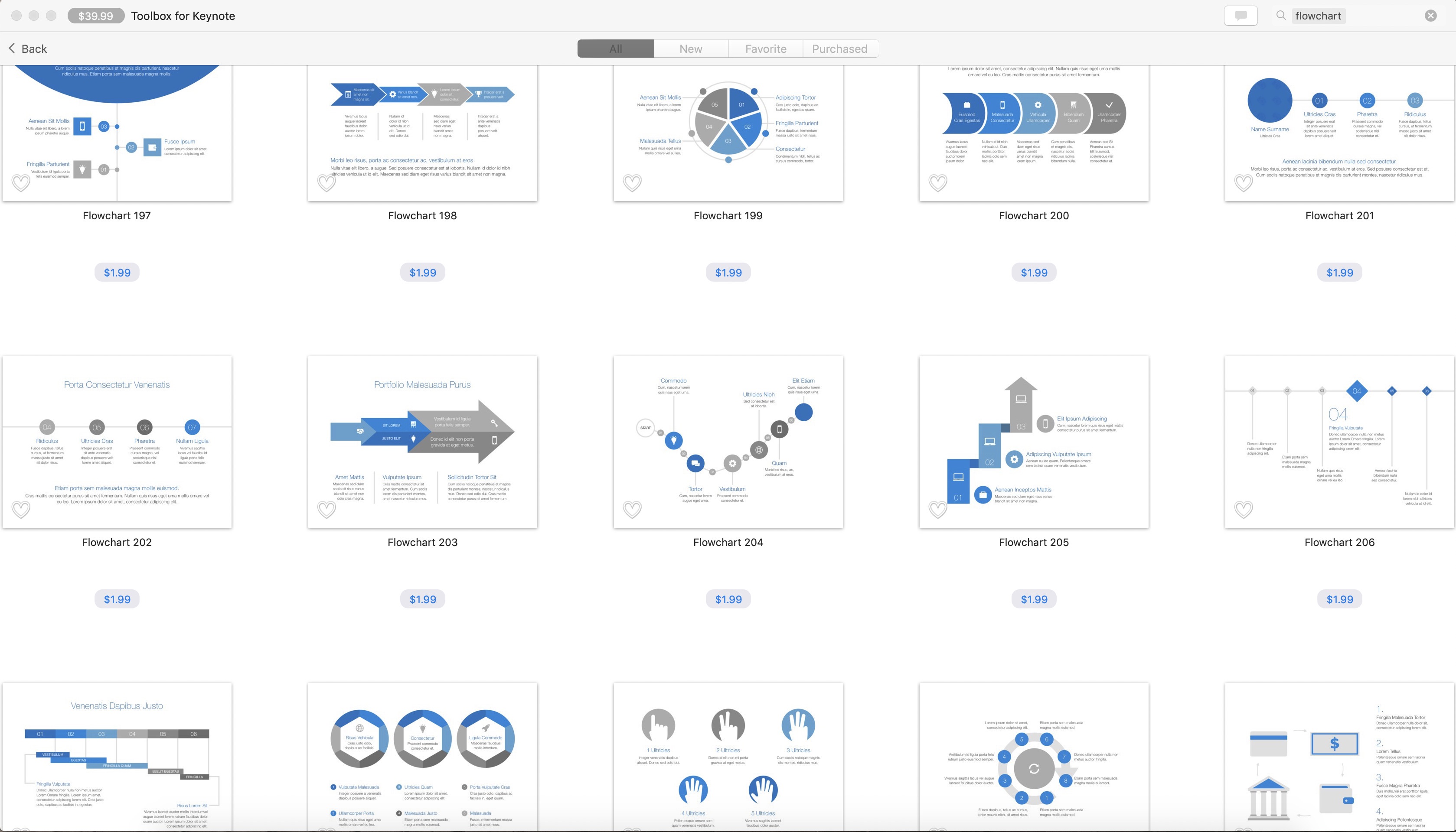
Without a doubt, the star attribute of Keynote (or Powerpoint or even Google Docs), is accessibility. You would be hard pressed to find an individual within your organization that does not have access to, and some experience with, either Keynote or Powerpoint. These tools are intuitive and ubiquitous, and they are components of larger software suites that can offer embedded, additional functionality to your digital journey maps.
Unlike the other programs reviewed, Keynote and Powerpoint are unique because their core functionality is built around creating presentations. But for simple journey maps, presentation-based software might be the perfect quick and sleek tool to use. Determined designers have proven that even more ambitious projects can be done. If you need to quickly translate a whiteboard and sticky note brainstorm into a more polished, digital format, Keynote can be a worry-free choice. There is no need to get caught up in subscription payment or learning the ropes of a new interface. You can hit the ground running and produce and editable, shareable file for the team.
The desired fidelity of your final product should tell you whether or not Keynote will be your champion tool. If you’re creating a journey map to get the creative juices flowing and articulate a simple sequence of pain points, you can export to PDF and call it a day. But if you’re looking for a deep dive into the experience of your customer, think about upgrading in a subsequent iteration to a tool designed explicitly for journey mapping.
Rating
- Collaboration: 4/5
- Value: 5/5
- Visual: Control 3/5
- Adaptability: 3/5
Strengths
- Near universal accessibility of tools across organizations
- Libraries and clean and appealing assets & visual styles
- Group editing capabilities & non-Mac user iCloud platform
Items for Keynote to Explore in Future
- Improvements to UI when zooming far into a page for detail-oriented edits
- More robust set of options for creating workflow maps and complex visualizations
- More prevalent showcasing of group editing features, and accompanying tutorials
- Better solutions to manage exceedingly large file formats overtime
Pricing Tiers
- Free for Mac Users
- Free for All Users via iCloud Site
Conclusion
In a project scenario, it is unlikely that you’ll pick just one tool and have it prevail with flying colors at each step of the journey mapping process. We used all of this software (after a significant amount of pencil-and-paper sketching) on a recent project. It’s critical to balance the demands of the task at hand, with the ultimate goals and delivery vehicle for your journey maps.
Below is a summary of the ratings we gave each of these software products for their utility and efficacy is crafting a customer journey map, from sticky notes to a polished product.

Download a copy of this infographic for offline reading here.
Using another tool? We’d love to hear your opinions or work with you to make your journey mapping ambitions a reality!

The views and opinions expressed in this blog are those of the author(s) and do not reflect the official policy or positions of Cantina or any other agency, organization, or third party. The author has no current affiliation with any of the above vendors.